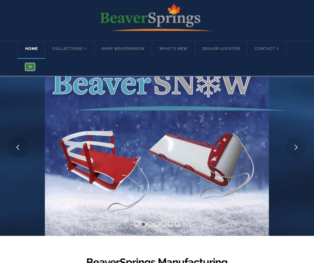
Shopping cart icon in menu wraps on small display sizes

beaversprings.ca

The little green shopping cart icon on the right of the navbar menu wraps on a smaller browser window.

Is there any way to force the menu not to wrap, or best still, to switch to mobile menu display?

How can I prevent the menu from wrapping, and from hiding a portion of the banner, as it is doing in the attached screenshot?

Thanks.

Hi there,

Thanks for writing it.

There is a limiting width, please add this CSS to your global custom CSS.

@media ( min-width: 980px ) and  (max-width: 1139px) {
.x-navbar-inner .x-container.max, .x-navbar.x-navbar-fixed-top.x-container.max.width {
width: 100% !important;
}
}

Since it has fixed to the position, it will cover the banner depending on current scroll top and header height. But let’s try the above CSS first to see if you still need to change the minimum height of your header for the banner.

Thanks!

Hi Rad - that solution appears to work perfectly! Thanks very much.

Glad to hear it!

This topic was automatically closed 10 days after the last reply. New replies are no longer allowed.