Hi. This is the mobile view of my post. The date (below the post title) is set at 13px, which looks fine on a laptop/desktop screen. But too big on mobile.
I’d like to reduce the size for mobile view only.
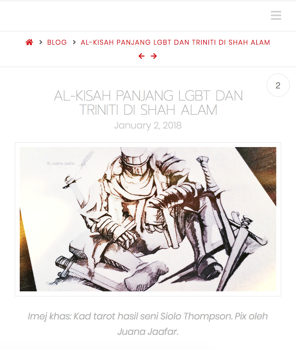
Hi. This is the mobile view of my post. The date (below the post title) is set at 13px, which looks fine on a laptop/desktop screen. But too big on mobile.
I’d like to reduce the size for mobile view only.
Hello Jaafar,
Thanks for asking. 
You can use following CSS under X > Theme Options > CSS:
@media only screen and (max-width: 600px) {
    .entry-header .p-meta .entry-date {
    font-size: 12px;
}
}
1- I have found the proper CSS code selector using the Chrome browser Developer Toolbar: https://www.youtube.com/watch?v=wcFnnxfA70g
2- For the CSS code itself, I suggest that you get started with this tutorial: https://www.youtube.com/watch?v=yfoY53QXEnI
Thanks.
It works. Excellent, thanx.
You are most welcome.
This topic was automatically closed 10 days after the last reply. New replies are no longer allowed.