hi… see this image: I need to force the mobile menu before the menu becoming on 2 lines… how can I do this? tnhs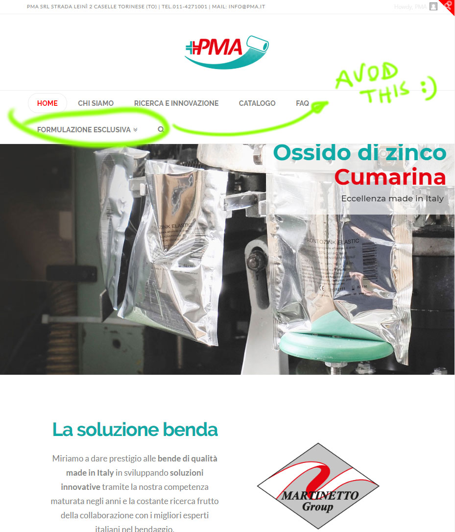
Hey Mauro,
Please add this code in X > Theme Options > CSS:

@media (min-width: 1080px) {

    .x-nav-wrap.desktop {
        display: none
    }

    .x-nav-wrap.mobile {
        display: block
    }

    .x-nav-wrap.mobile.x-collapsed {
        display: none;
    }

    .masthead-inline .x-btn-navbar {
        display: block;
        float: right
    }

    .masthead-stacked .x-btn-navbar {
        display: inline-block
    }

    .x-navbar-fixed-top-active .x-navbar-wrap {
        height: auto
    }

}
Feel free to change 1080px in the code above to the resolution when you want the mobile menu to start showing up.
Kindly note that since this is a custom code that changes the default behavior/display of the theme, you will be responsible to maintain or update the code in case you require further changes or if the code stops working in future updates.
Here are some related links for further reading:
- Intro to CSS - https://goo.gl/mFuWQT
- How to get CSS selectors - https://goo.gl/BmoH39
- Get Started With Viewing And Changing CSS - https://goo.gl/7xFhDa
- CSS Media Queries - https://goo.gl/L3ZHNg
Hope this helps.
perfect! tnks!
You are most welcome. 
This topic was automatically closed 10 days after the last reply. New replies are no longer allowed.