Hi there,
The solution given on the other thread is not ideal because, as mentioned by @christian_y, the CSS code if referencing the dynamic classes assigned to the section and columns which would change as you edit your page content causing the code to possibly stop working.
Now, what you can do is to set the three columns on that row to have an equal height then set add a CSS code to reference the image and position it to the bottom of it column.
To do that, please add a class to the row that contains the columns. You can do that by clicking on the customize option of the row setting.
Once you have added the class, please add this CSS code in the Global CSS panel:
.flexmethod {
  display: -webkit-box;
  display: -ms-flexbox;
  display: flex;
  -ms-flex-line-pack: stretch;
      align-content: stretch;
  -ms-flex-wrap: wrap;
      flex-wrap: wrap;
}

.x-container:before {
  content: normal;
}
The code above assumes that the class you have added to the row is flexmethod. Please update the code if you used another class name.
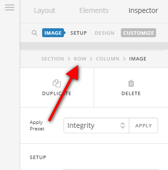
Then, add a class to the image element. You can do this by clicking on the customize option of the image element as well.
Once you have added the class, add this code as well in the Global CS:
@media (min-width: 768px) {
    .bottom-image {
        margin-bottom: 0;
        position: absolute;
        bottom: 0;
        left: 0;
    }
}
Also, the code assumes that the class you added to the image element is bottom-image.
Please take note that this approach is a solution based on your current setup but should work as long as you have the correct classes and code added to the correct element. Also, since this is a custom code, there is chance that this might stop working depending on how you change your current page setup and you will have to update the code accordingly as it falls beyond the scope of our support.
You can find more info on how to check for CSS selectors here.
Then information about writing your custom CSS here.
Hope this helps.


