Sections Not Full Width Outside Editor

Salutations,
The sections inside the editor are appropriate size. However, when viewed live, they are shortened. I have attempted using inline CSS (Min-height Property), though it causes gaps on mobile. Included is a photo of editor environment. Please compare it to the live website www.northwestacademybjj.com.

Unfortunately, Cornerstone documentation is outdated. I have spent 6 hours on this problem!

Renew Stack
Boxed
Default Template

Section 1 (Introduction)
Size: 100%
Position: center
Margin: Top is -41px, remaining are 0.
Padding: Top and Bottom are 45px, remaining are 0.
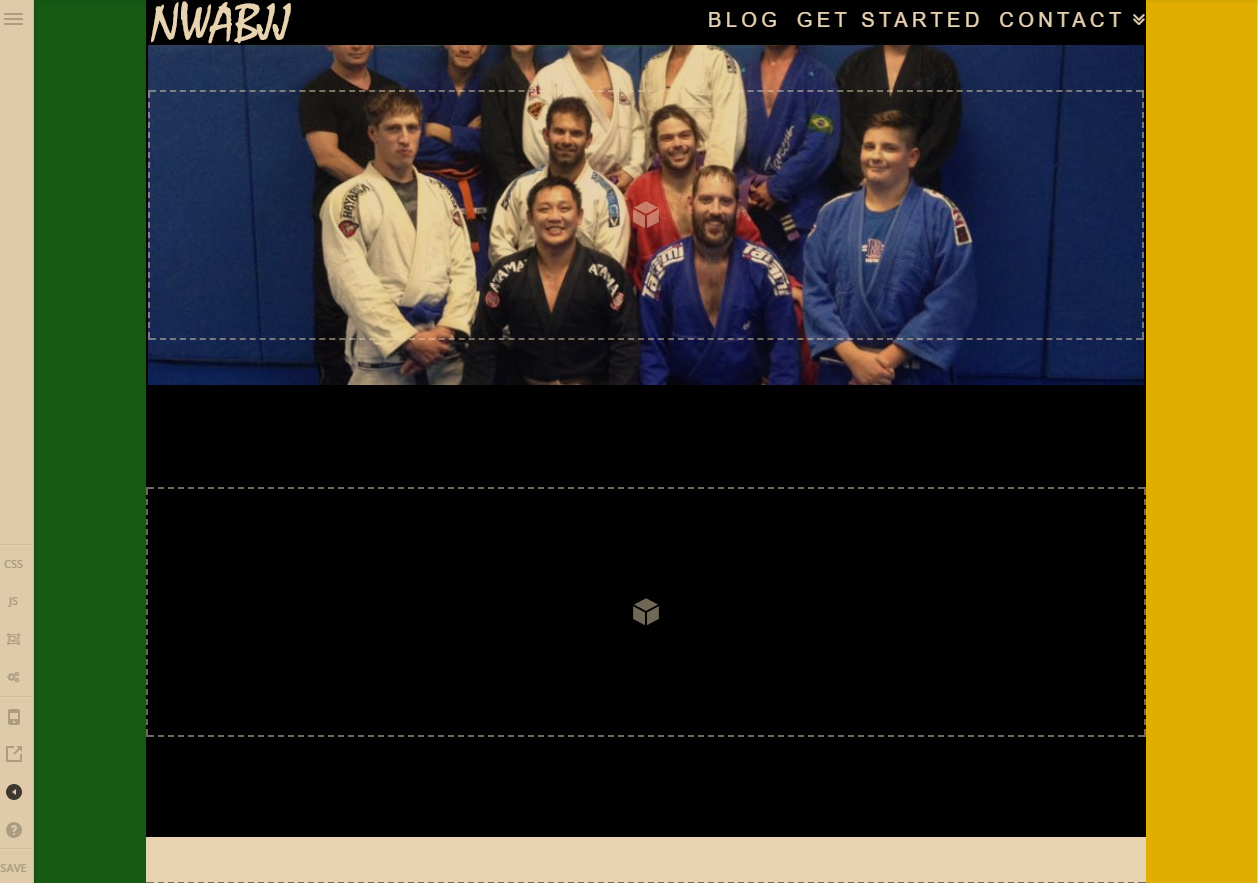

Hi There,

Can you clarify your expectation here? On title you are referring to width but on your initial message you are referring to min-height. I am not sure though what you are trying to achieve because with your current settings, what you have on the frontend is the correct output.
In content builder / Cornerstone if section have no content or element it has default minimum height. Background image will stretch depending on the height and width of the section where it is added. That is why it is visible on the builder. On the frontend there is no minimum height. That space you are seeing are the default 45px top and bottom padding for the section.

Regarding width, I can see you have set site width to 100%. Aside from that, Site max width also works. The entire content container is controlled by your site width and site max-width settings from Theme Options.

Thank you,
To clarify, I want the section to appear as it does in the builder.

Am I correct to say that that is contingent upon settings in Theme Options?

Hi there,

I see the issue now. We will require your login credentials to take a closer look. You can submit the following information in secure note.

  • Your site URL
  • WordPress login credentials

Could you please also update your X theme to the latest version.

Thanks!

Thank you. X is up to date.

Hi There,

Unfortunately, your site is not loading. It says:
503 Service Unavailable No server is available to handle this request.

Though from your screenshot, if you want to add the image as background on a section without a content, just like GAP element and set height accordingly

Hope this helps.

That’s odd. It loads fine for me on all browsers/devices. But I’ll try your suggestion! Thanks!

Let us know how it goes.

Hi again!
Adding gap elements solved this issue on screen sizes greater than 480px. I’ve uploaded a screenshot showing the website appearance on smaller screen sizes.

The demo pages don’t have this problem. Ironically, their ‘classic’ elements accommodate my photo perfectly.

I will try another stack.

Hi there,

It looks different on all my tests, there is no white gap and the logo is a long text “North West Academy of Brazilian Jiu Jitsu” instead of just “NWABJJ”. Have you recently changed it to force its height?

For the meantime, please add clear:both; to your section’s Style input.

Thanks!

Hello,
Yes, I tried incorporating classic elements into my project. The customizer looks different at the moment. I believe I have found a solution and will follow-up tonight.

Let us know how it goes!

Thanks

Hello again,
The closest I’ve come to solving the problem is adjusting column padding. It looks bearable on PC and huge on mobile. How could I make it relative to screen size?

I have spent a week on this problem. Frankly, it is unacceptable. Sections are a key feature yet unintuitive. The documentation is completely outdated and not helpful. I just want it to behave like sections from example websites and demos.

Hi There,

Sections, Rows, and Columns are responsive in nature. just don’t apply a negative margin, huge paddings on it, and other CSS property that may disrupt the responsive behavior of an element.

Please understand how a background-image and an Image element behave.

background-image depends on the height of its container. If the container does not have enough height the background image will be cut off. Keep in mind that you can not perfectly fit a background-image on all screen sizes. You can test that here.

I think what you’re looking for is the responsive behavior of the Image element

Please see the difference on the test page I’ve created.

Hope this shed some lights,
Thanks!

Hello,
I appreciate the initiative. The test page uses classic image elements. How do I resize the modern image element?

I’ve taken the suggested approach and combined classic elements with modern ones. This is satisfactory for now. Thank you for all your help.

Hi there,

Ah, glad it’s okay now. Yes, even with different version of element, sizing should be the same.

Thanks!

The descriptions imply that classic elements are being phased out. They still appear to be relevant. What is Apex’s plan for them?

Hi there,

That’s not something I can answer as we’re not sure either. But I think it would stay there for long until most of the users are already migrated to the new format. But even if it’s changed, I don’t think there will be issues since the shortcodes are generated by cornerstone, if there will be new format then cornerstone will just generate it to that format (unless you have copied and pasted the shortcode somewhere, then that means that shortcode became static).

But regardless, any major update should be tested first as it can varying effect to existing sites.

Thanks!

1 Like

Really appreciate your patience. It’s tough without documentation. :frowning: Clientele have been impressed with product thus far!