Section/row not moving margin

Hi themeco

I am trying to make my section auto scale on smaller screens but I am not achieving that

Here is my site and below is a screenshot of what I’m working with
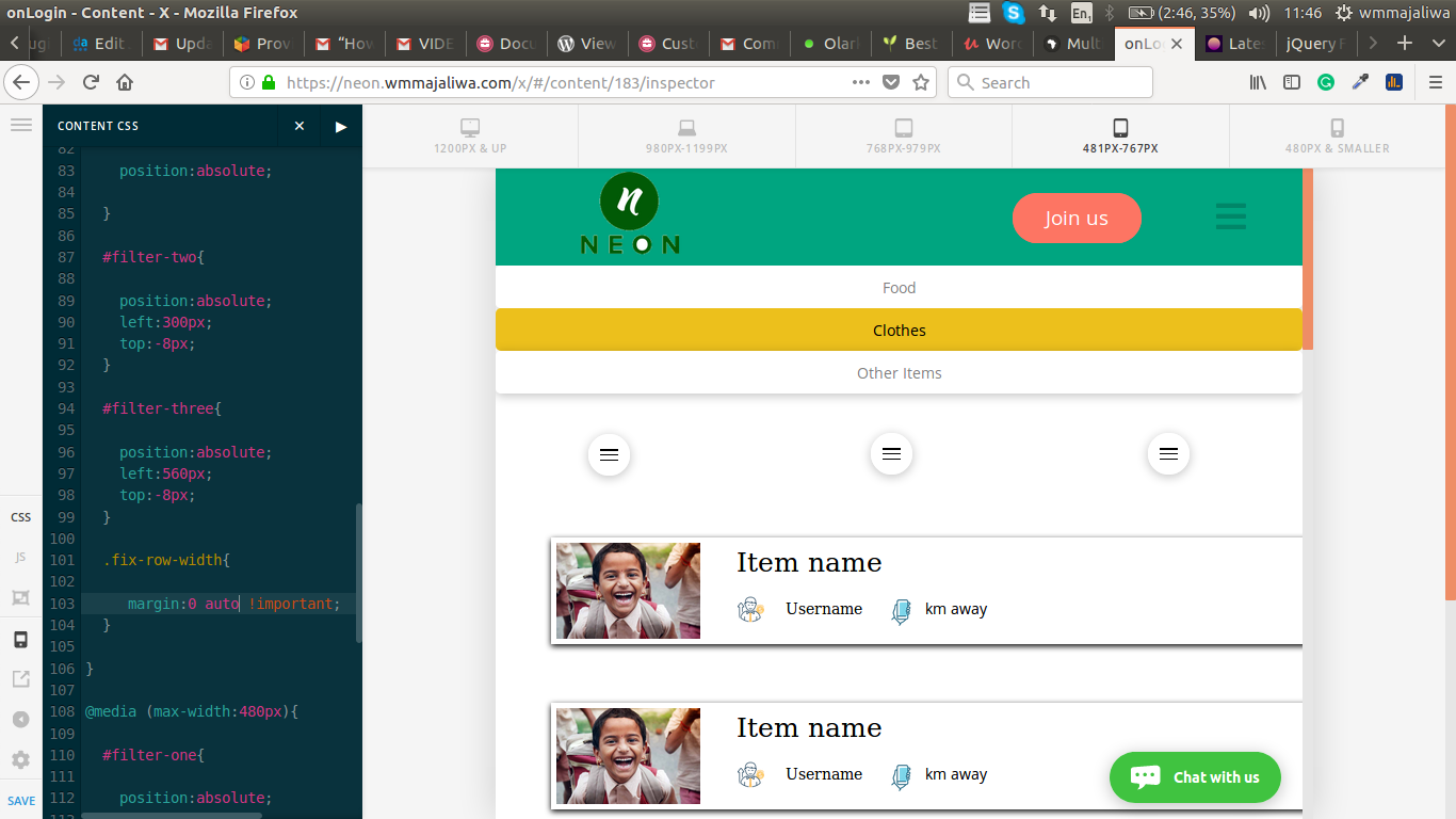
How would I manage to make the rows left and right width auto?

This css is not doing what I think it should be doing

.fix-row-width{
  
     margin:0 auto !important;
  }

Need some help here, Thank you
Hi There,

Thanks for writing in!

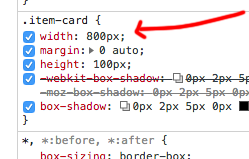
I can see the section is centered align but the card item width set to 800px. Which is not resizing according to device screen size.

Please make the width auto or set max width. So that it will respond and keep in the center of any device screen.

Thanks

Hi Basanta

Thanks for the feedback
I changed it to auto

It works

You are most welcome!

This topic was automatically closed 10 days after the last reply. New replies are no longer allowed.