On the following page: https://bridginggaps.org/internships/cape-town/architecture/
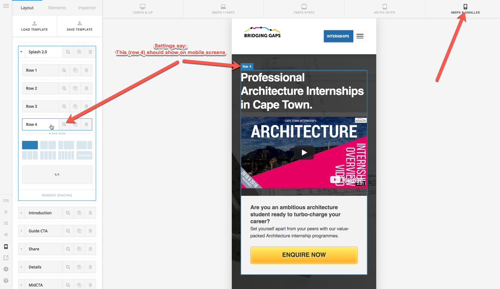
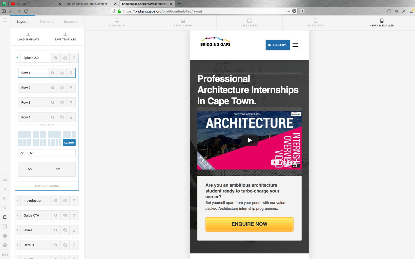
The header section ‘splash 2.0’ consists of four rows as shown in pro content editor screenshot.
-
Row 1 is set to display only on desktop
-
Rows 2 & 3 are set to display only on tablet
-
Row 4 is set to show only on mobile
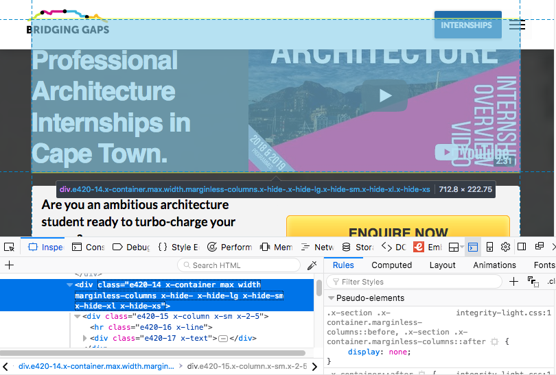
Everything works fine except for the Row 4 … it doesn’t show on live mobile render… even though it shows correctly in the builder. Aside from that everything else on this page functions as it should.
Note:
-
I have a couple of custom pieces of CSS on this page to style the CTA buttons and links
-
I also have a couple of javascript scripts which interact with the CTAs too for tracking purposes.
Any help appreciated
Additional Screenshots for clarity: