Hi,
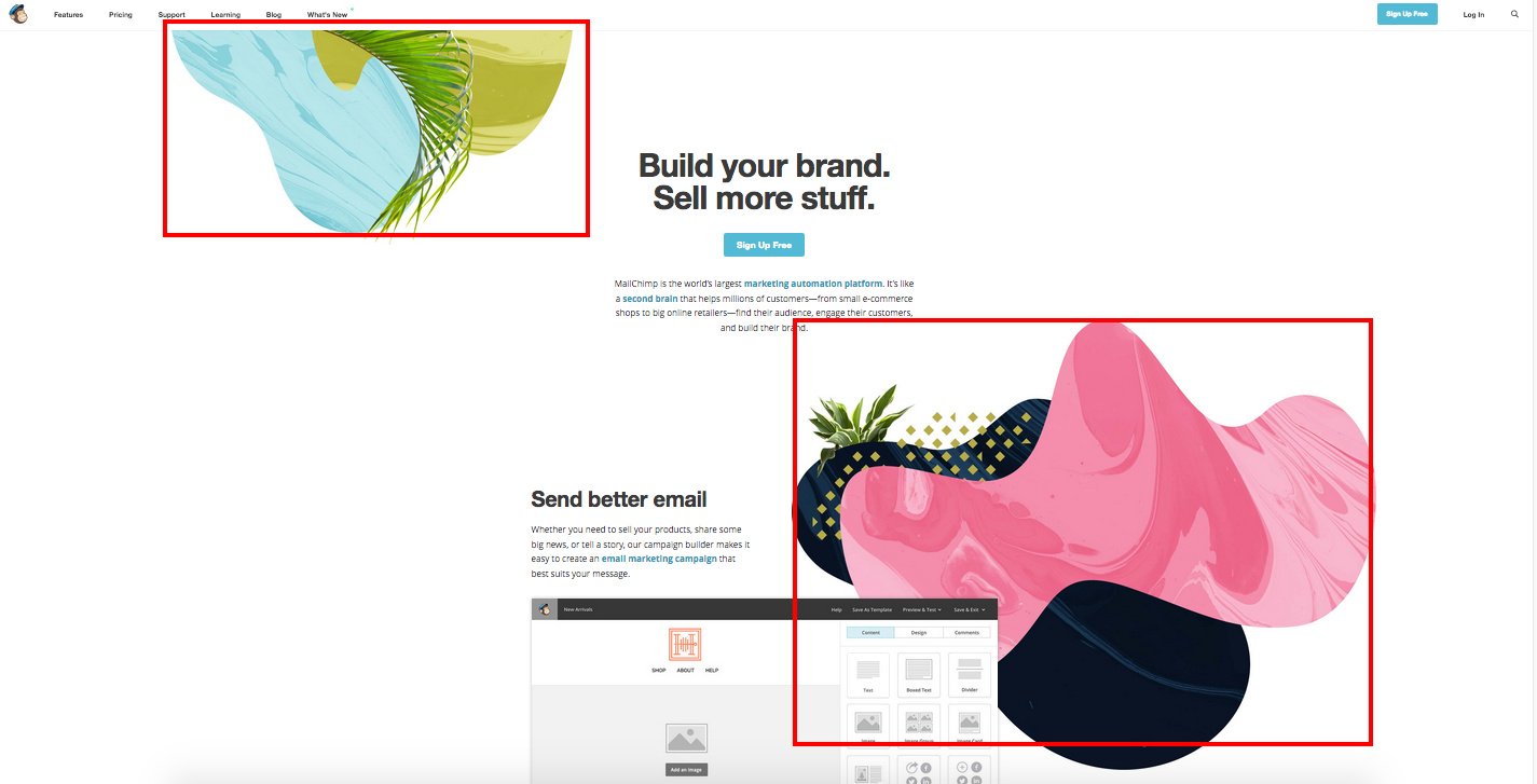
I’d like to create something similar to this. See image below. It’s Mailchimps homepage.
I guess I can do this by using background section but what settings do I need to use to get 1 image at the top left corner and 1 in the bottom right corner?
Hi,
I’d like to create something similar to this. See image below. It’s Mailchimps homepage.
I guess I can do this by using background section but what settings do I need to use to get 1 image at the top left corner and 1 in the bottom right corner?
Hi There,
You can set the BACKGROUND LOWER LAYER and BACKGROUND UPPER LAYER of the sections:
The position of the lower layer should be top left and the upper layer should be bottom right.
Hope it helps 
Thanks. That helps.
One question though. How do I make it responsive? So that it will go away when viewing the page on tablet or mobile?
The problem now is that the image moves through the text on mobile which results in a bad reading experience.
Thanks.
Hi there,
To do that, please add this code to the Element CSS of the section where you set the background image:
@media (max-width: 767px) {
  $el .x-bg div {
    background-image: none !important;
  }
}
Hope this helps.
That works. Thanks!
This topic was automatically closed 10 days after the last reply. New replies are no longer allowed.