Hi there,
I did researches to find a topic similar on the forum and I found nothing. However, to my opinion this is an important step to any kind of website. So I wonder if this is possible the modify the XS and SM layouts in order to insert a sandwich menu here while the MD LG and the XL have buttons menu? I need to know at least if this is possible to make a sandwich menu for Cellphone sizes by affecting the layouts inside the row?

Hi Matt,
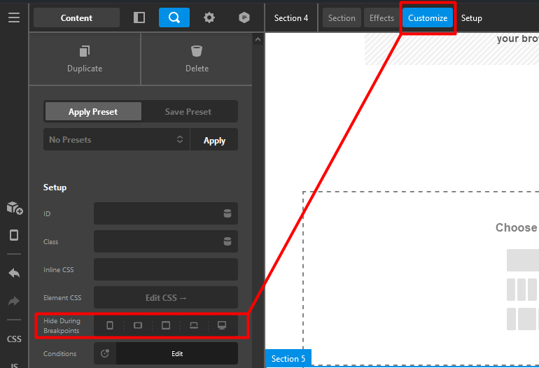
Thank you for reaching out to us. You can achieve this by adding two different sections, one would be for desktop screens (MD, LG and XL) and the other would be for (XS and SM) now using Hide During Breakpoints feature, hide the sections respectively, for example:
For the mobile section (XS and SM) and go to Customize tab and hide it for large screens (see screenshot)

similarly you need to hide the desktop section (MD, LG and XL) in smaller screens:

This way you have setup two different sections that are shown in different breakpoints, now add the Navigation Inline element in the desktop section and Navigation Collapsed element in the mobile section
Hope this helps!
1 Like
Hi Nabeel,
Thank you I get the idea now, pretty clear enough and straight forward! I got to search but I found the Hide During Breakpoints menu 
You are most welcome.
If you need anything else we can help you with, don’t hesitate to open another thread.
This topic was automatically closed 10 days after the last reply. New replies are no longer allowed.