I am using Pro and I have a revolution slider on my home page set to full width. When the screen width becomes narrower, it zooms in on the images but I would like to be able to see the full width of the images regardless of screen size. Can you please let me know how to do this? Thanks.
Hi There,
Thank you for writing in, on your Slider Settings, please set the Slider Layout to Auto (more details on the link below), this will make your slider image responsive without losing its aspect ratio.
https://www.themepunch.com/revslider-doc/slider-setup/#slidelayout
Hope it helps,
Cheers!
Great, thanks for your help. How do I ensure that none of the slider images sits in behind the navbar?
Hi,
I can see your slider background images are currently set to cover which means to Resize the background image to cover the entire container, even if it has to stretch the image or cut a little bit off one of the edges.
You can set it to contain - Resize the background image to make sure the image is fully visible but there might be some white spaces.
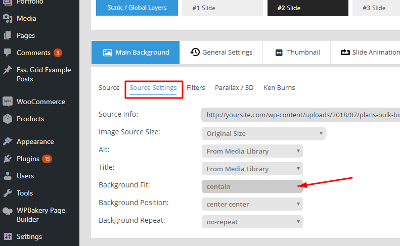
You can check how other options from the link below.
https://www.w3schools.com/cssref/playit.asp?filename=playcss_background-size&preval=50%
Thanks
Thanks for your help but like you said, this creates white space on either side. Is there any CSS code I could apply so the slider begins directly beneath the masthead or some other solution?
Nevermind, I found a fix. I’ve kept the slider images set to cover but gone into Header Builder > Bar 1 > and changed the Initial Position from Absolute to Relative
Glad to hear that. 
This topic was automatically closed 10 days after the last reply. New replies are no longer allowed.