I would like to remove the gap underneath the revolution slider on my website. The slider is set to full width and center top. I would like the next section under the slider to start straight after the slider if possible. Screenshot attached showing bottom of slider and gap to next sections content.
Hello Ciaran,
Thanks for writing in!
Please add following CSS under X > Theme Options > CSS:
.tp-fullwidth-forcer {
height: 525px !important;
}
@media only screen and (max-width: 600px) {
.tp-fullwidth-forcer {
height: 105px !important;
}
}
@media screen and (min-width: 768px) and (max-width: 1400px){
.tp-fullwidth-forcer {
height: 260px !important;
}
}
1- I have found the proper CSS code selector using the Chrome browser Developer Toolbar: https://www.youtube.com/watch?v=wcFnnxfA70g
2- For the CSS code itself, I suggest that you get started with this tutorial: https://www.youtube.com/watch?v=yfoY53QXEnI
Thanks.
Thanks Prasant, much appreciated. However it seems to have moved the content too high and now it appears in front of the slider. See screenshot below.
I don’t know if this is affecting it but I previously put this CSS in when a red line appeared on bottom of slider.
.x-slider-container.below {
border: 0;
}
Hello Ciaran,
Thanks for writing in!
Actually your slider is position right above the sections of your page. The problem is that the image size which you have added as as slide background were set as “Contain”. Please check it to “cover”. And please be aware that with cover, the image will be cut off because it will adjust and reposition itself to cover the whole slide. For mode information, please check this documentation particularly the background fit:
Hope this helps. Please let us know how it goes.
Thanks @RueNel, I had previously set the background to cover but changed it because I wanted the full width of the background image. Is this the only option or could the @Prasant suggestion above be used to close the gap?
Hi Ciaran,
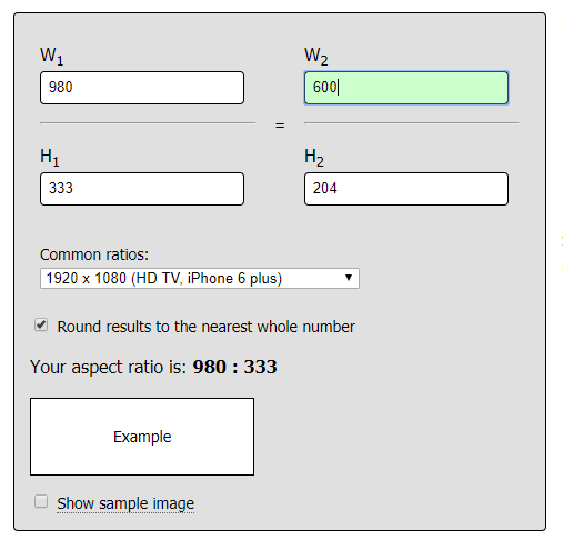
It would fix on that current setup but not always, the slider is responsive while you’re forcing it to specific size. I recommend setting it to Cover. If there is a problem with spacing then maybe you should based your slider size to your image aspect ratio. Example, if your background image has 980x333 dimension, then your slider dimension should be 980x333, or 600x204, or 500x170.
https://andrew.hedges.name/experiments/aspect_ratio/
This is to make sure there are no gaps and spacing within the slider regardless of device. But make sure your slider isn’t configured for full-screen, else, the aspect ratio will be ignored.
Thanks!
You are most welcome!
This topic was automatically closed 10 days after the last reply. New replies are no longer allowed.