when in mobile, i want the columns to reverse the order that they stack:
Summary
The columns in this row:
Summary
Thanks in advance.
when in mobile, i want the columns to reverse the order that they stack:
The columns in this row:
Thanks in advance.
Hi there.
thanks for writing in!
The best way to do this is, create a mobile version of the section and arrange the columns as per your requirement for mobile device and hide it in other device.
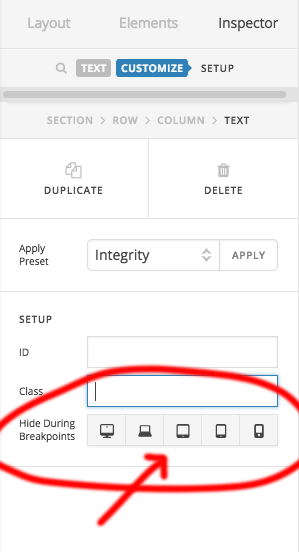
The original section can be hide in mobile device so that when it comes to mobile the second lay out would show and the original layout will hide.
Just duplicate the original section and rearrange the columns as per your requirement for mobile device and hide it for other device in customizer panel. same for the original, hide it in mobile.
Hope this understandable.
Thanks
I don’t think that’s the best way to do it…
How can I make the columns flex in a reverse order?
I don’t want duplicate content.
Hi There,
Unfortunately, that is not a featured offer by X and could be done with custom development which would fall out of the scope of our support.
I do recommend you following Basanta´s recommendation.
If you wish to do via CSS you might consult with a developer.
Thank you!
This topic was automatically closed 10 days after the last reply. New replies are no longer allowed.