Rev slider on iphone6

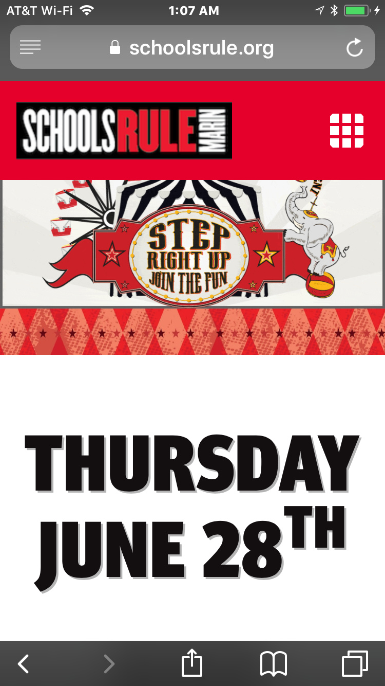
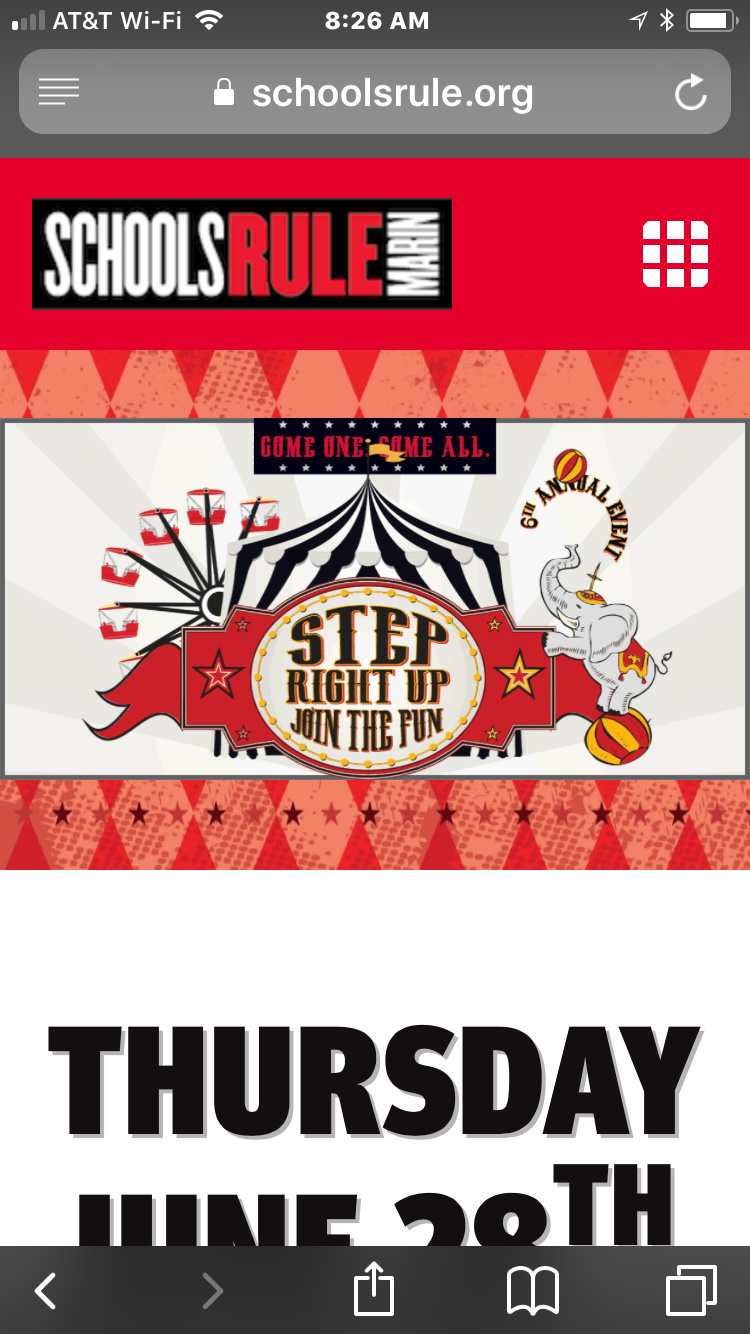
Hi there. I am hoping there is a way to have this image not hidden under the menu on mobile I thought I was going to be able to do it by selecting the viewport in - I had thought that was for viewing and doing tweaks for that view only but it seems to make the change universal. All I am trying to fix is that the slider hides under the menu - at least on my older iPhone 6. Is there a way to adjust for that? URL https://schoolsrule.org/2018-schoolsrule-marin-fundraiser/
Screenshot:
Thank you.
Hi,

Thanks for writing in!

I think what you are trying to achieve is for your navbar to be not fixed on mobile?

If that is the case, you can add the code below in Header > CSS

@media(max-width:767px) {
.x-bar-fixed {
    position: relative;
}
}

Hope that helps.

It didn’t help. But I used your code to do this. Is it going to cause me trouble for other portrait views at this size

[quote]
@media(max-width:767px) {
.x-section .x-container.marginless-columns .x-column.x-1-1{
padding-top:90px;
}
}[/quote] Thank you!

Hi GeorgiaG,

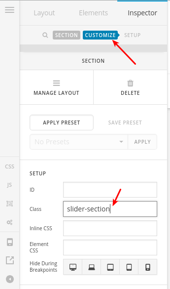
The code you added is fine, but it might affect sections on other pages as well, so I recommend adding a custom CSS class (slider-section for example) to this section that includes the slider as in this screenshot:

Then target that specific section only via this code:

@media (max-width: 767px)
.slider-section .x-column {
    padding-top: 90px;
}

Thanks.

1 Like

Thank you!