Responsive Video - Not responsince on browser max

Hi,

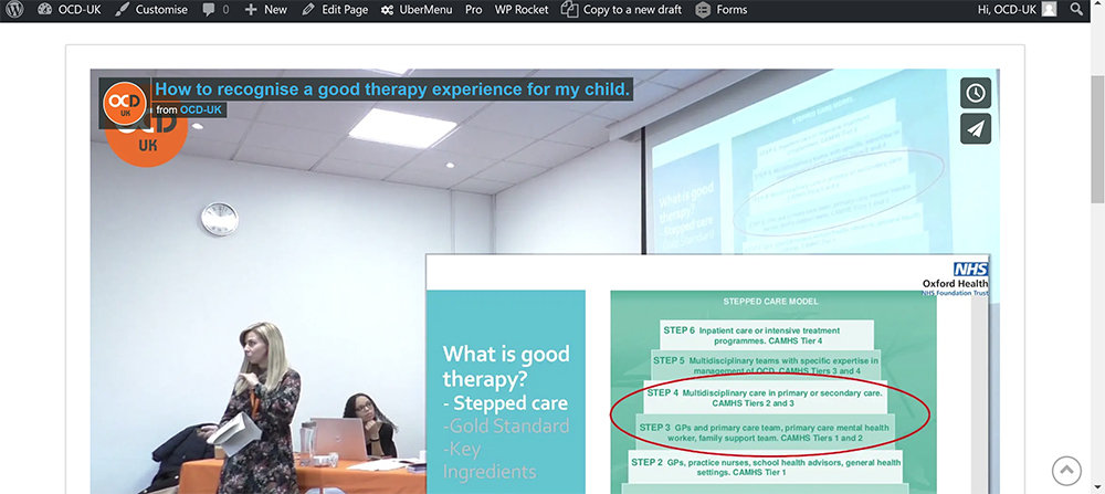
I have tested on IE and Chrome. But with a video embed if I adjust the browser size it is fully responsive, works perfectly. But if the browser is on maximum and say I am using a small 11" laptop, it doesn’t seem responsive for the screen.

This is the link:

https://www.ocduk.org/parents/parents-conference-presentations/how-to-recognise-a-good-therapy-experience-for-my-child/

This is a screenshot from my small Dell laptop.
Hi @ocduk,

Thank you for writing in, I can’t replicate the issue on my end, that issue seems to be a device/laptop specific, the mobile needs to respond proportionally, it seems your laptop display aspect ratio is wider than 16:9 that’s why the video cant fit proportionally. Set a max-width to your Row containing the video so it does not get too wide and the video does not get too tall on your Dell laptop.

Cheers!

This topic was automatically closed 10 days after the last reply. New replies are no longer allowed.