Hello, I am trying to get text in essential grid to adjust to be smaller on smaller screens. I have a few grids that have a large amount of text that slides in on hover. I’ve found a couple of helpful posts but none that fix the issue fully for all text. The grids I’m working on are here: http://marinelair.cantercompanies.com/features/ and http://marinelair.cantercompanies.com/materials/ … thanks in advance for your help!
Hi There,
Thanks for writing in! The text in the slide seems to be displaying the post excerpt. Please limit the excerpt so that the text can be accommodate when the when gets smaller. You will need use manual excerpts or change the excerpt length in X > Launch > Options > Blog > Content and set the excerpt length to 20. You might need to turn on “FULL POST CONTENT ON INDEX”, insert 20 in the excerpt length, hit the save button, turn off “FULL POST CONTENT ON INDEX” and hit the save button again.
If the font size of the text is too big for smaller screens, you can insert this css code in your custom css, in the X > Launch > Theme Options > Global CSS (http://prntscr.com/evui3r)
@media(max-width: 767px){
    body .eg-howardtaft-element-18 {
        font-size: 10px !important;
    }
}
Hope this helps. Please let us know how it goes.
That looks like it worked! Thank you so much I appreciate it!
Hey There,
You’re welcome! We are just glad we were able to help you out.
Thanks for letting us know that it has worked for you.
Cheers.
Hello! I wanted to follow up on this post. The code you provided above no longer works since recent updates… is there a way you could provide me with updated code to help with this issue of the text in essential grid getting cut off on smaller screens? I’m actually working on a different website than the one listed above and the essential grid instance that I’m referring to is here: http://stage.canterstrategicwealthmanagement.com (also see attached screenshot). 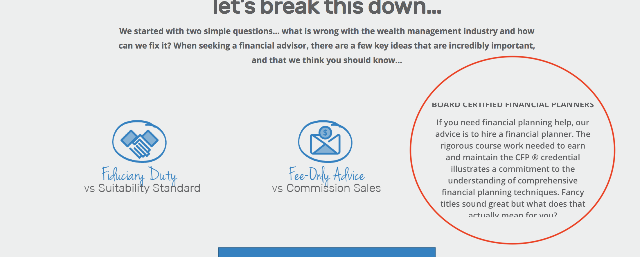
Thank you for your help!
Jenna
Hello @jmbalegn,
Thanks for updating the thread. 
Please try adding following CSS under X > Launch > Options > CSS to adjust font size on responsive mode:
@media only screen and (max-width: 767px) {.esg-center.eg-quincynew-element-7 {font-size: 8px !important;}}
Thanks.