Responsive text - how?

Hi,

I’ve been trying to get the responsive text feature right. On PC and smartphone it looks fine, but on tablet it looks to small. Isn’t there a smarter way to do it?

I’ve set the white big text to:
Compress: 1.0
Minimum size: 24
Maximum size: 74

But I don’t know what “compress” does and how the minimum and maximum works. Shouldn’t the text scale automatically between 24 and 74, or…?

Hi @Kobber,

Thanks for reaching out.

The responsive text is implemented through javascript where it changes based on the container’s size. Would you mind providing a sample URL where these texts are? I like to see how it’s implemented on it, because it may not work on v2 element depending on what selector is used.

Thanks!

Hi Rad,

Yes sure: https://vektropol.dk

Hello @Kobber,

The responsive text is working correctly on your site. The minimum and maximum will set as the minimum and maximum font size for the text. The compression is the multiplier of the font size. You can have a compression of at least 1.0 or less if you want smaller fonts.

Hope this helps.

I know what minimum and maximum is, but why is the text so small on tablets? It should be smallest on phones, medium on tablets and biggest on PC. That would be the point of responsiveness - wouldn’t it?

Hey @Kobber,

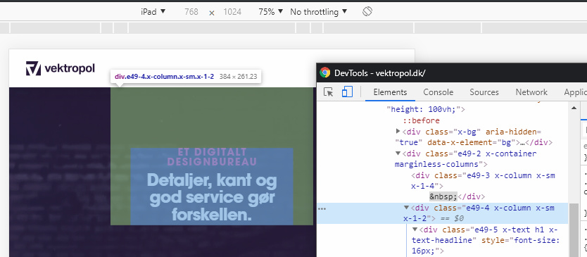
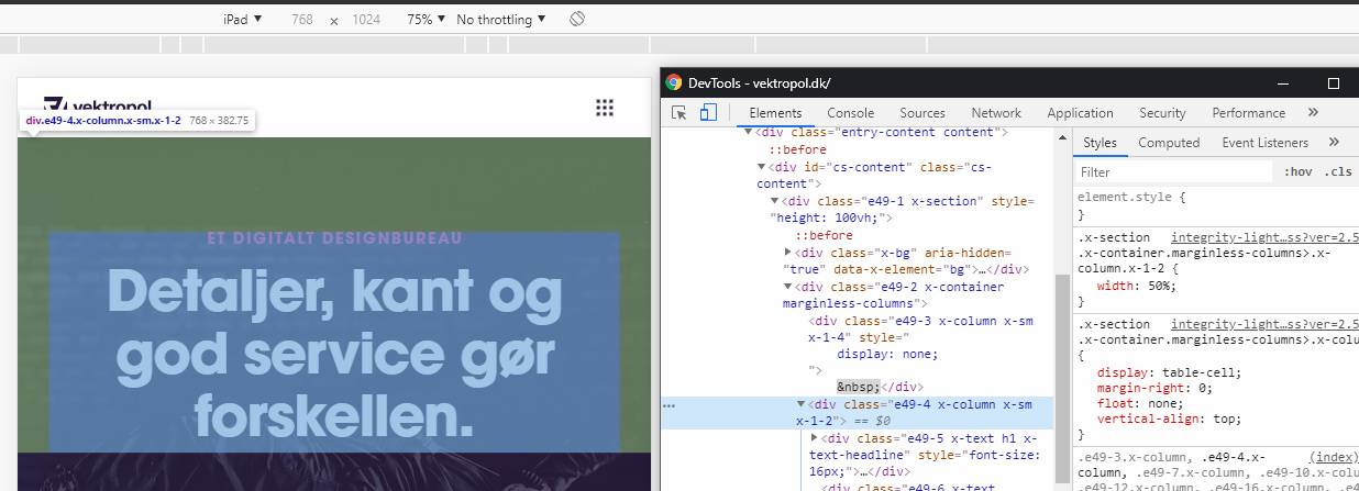
I’d first like to add that the Responsive Text feature relies on the width of its container and not the screen. Your setup is 3 columns and in the tablet view, the columns does not yet span 100% of the screen which is the reason why your text is small.

Since you’re using a Row with Marginless Columns enable, hiding the blank columns on tablet view using the Hide During Breakpoints feature should make the middle column span 100% even if it’s set to span 50% thereby increasing the size of the responsive text.

Hope that helps.

This topic was automatically closed 10 days after the last reply. New replies are no longer allowed.