Hello,
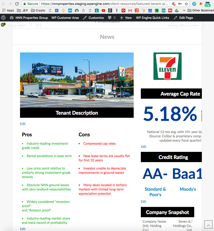
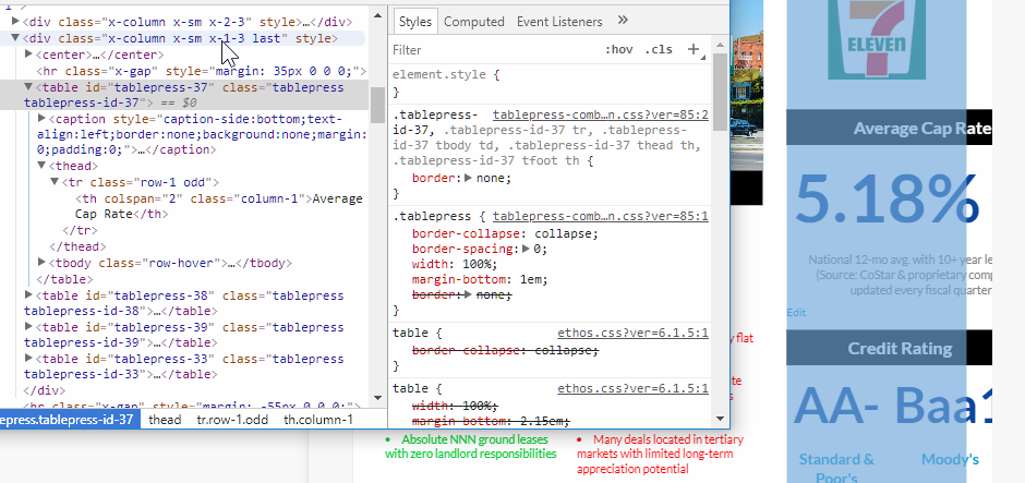
I am having issues with the “tab_nav” shortcode on the website. Please see the problem at the following page, and reference the attached image:
https://nnnproperties.staging.wpengine.com/client-resources/featured-tenant-profiles/7-eleven/
As you can see, when I shorten the width of the screen, the responsive code for the content in tabs 1 and 3 stops working. Actually for tab #3, isn’t not that bad because you can scroll to the right to see the financial data, but it’s a big issue in the first tab, which is the primary tab users will be visiting for information anyway. Can you help me correct this issue so all of the content says within the margins on any device, including tablets and mobiles? Thanks!