Responsive site for different mobiles

Hi,

i started designing this site

http://www.motherschoice.club/

i have worked on 2 templates one for mobile and the other one for the all other devices.

i have elements that or showing only in mobile.

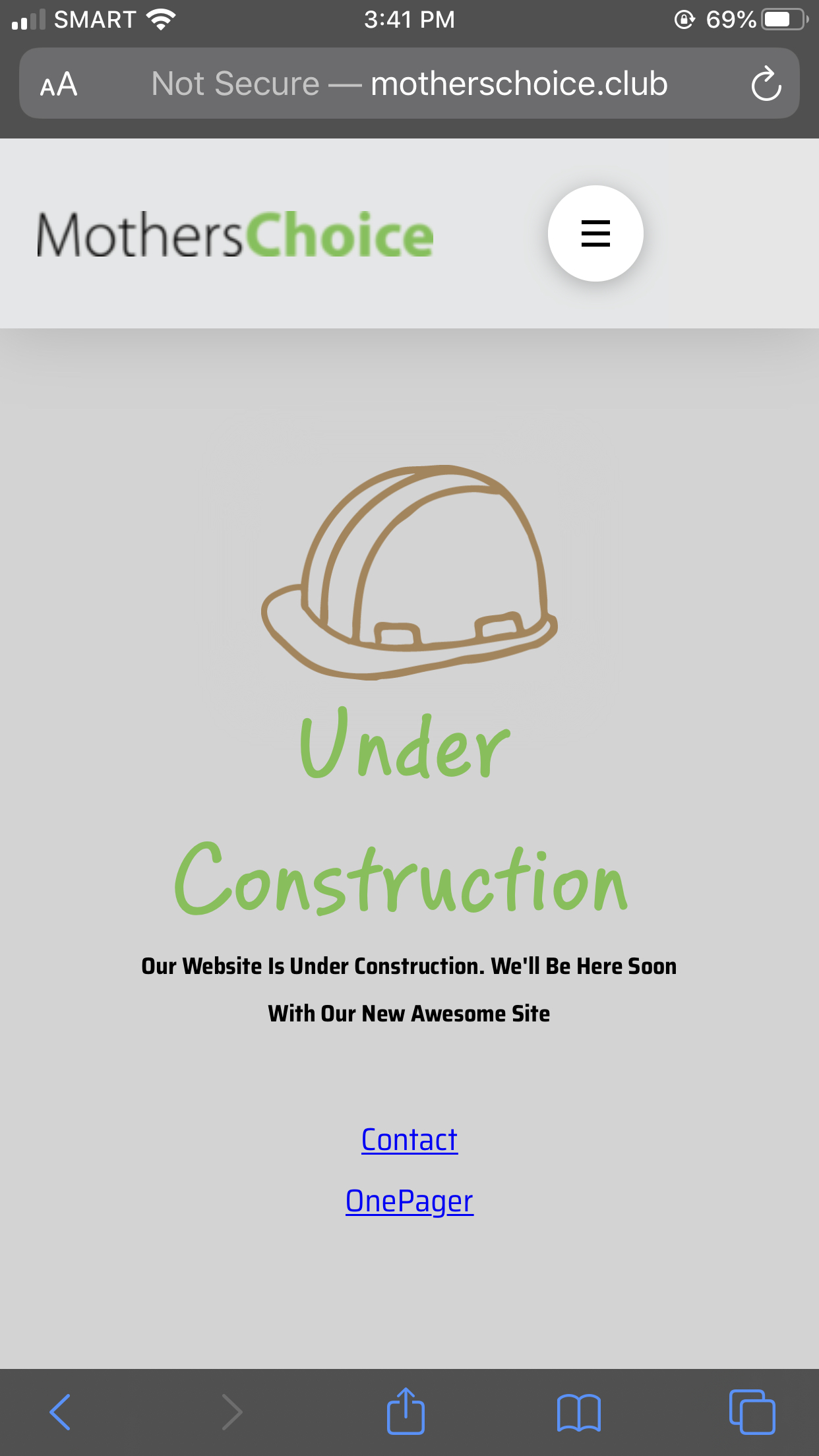
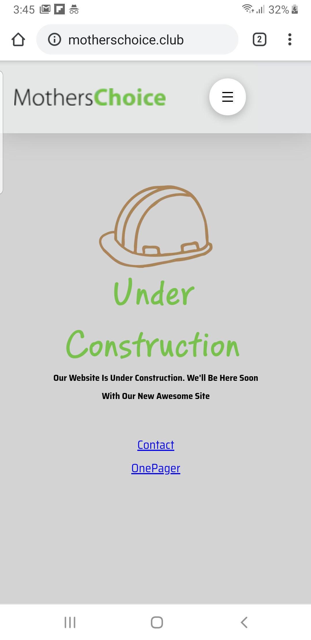
in an iPhone it dost show good but in my xiaomi it looks good.

also in the editor it looks fine.

how do i make the site more responsive to all mobile phones?

thanks

Ariel

Hey Ariel,

Would you mind being more specific which part of the site or which pages on the site are not appearing correctly on iphone?

I checked the site but the homepage has a coming soon page active and the rest of the pages do not have any content so I am not sure which area is in question.

Kindly specify so that we can provide some suggestions.

Hi, it is supposed to be coming soon.

The hamburger navigation in some phones you see it and some not


Hi, it is supposed to be coming soon.

The hamburger navigation in some phones you see it and some not

Hi Ariel,

Can you share which Iphone version you are having an issue? Check both on an iphone and samsung phone. It is showing on both:

Although, I notice that the container with menu for mobile have -17px margin. It is not recommended to use negative margins. Please remove it.

This topic was automatically closed 10 days after the last reply. New replies are no longer allowed.