I am sorry to bother you with this but I just can’t find this setting. I have a site, (http://yourartdirector.com), and I seem to recall that I set up widths in X Pro that determined how the main navigation behaved based. It works fine on my site, but now I am working on another site, (http://dynatem.com), and I can’t figure out how to set it up for that site.
Hello Kenton,
Thanks for writing in!
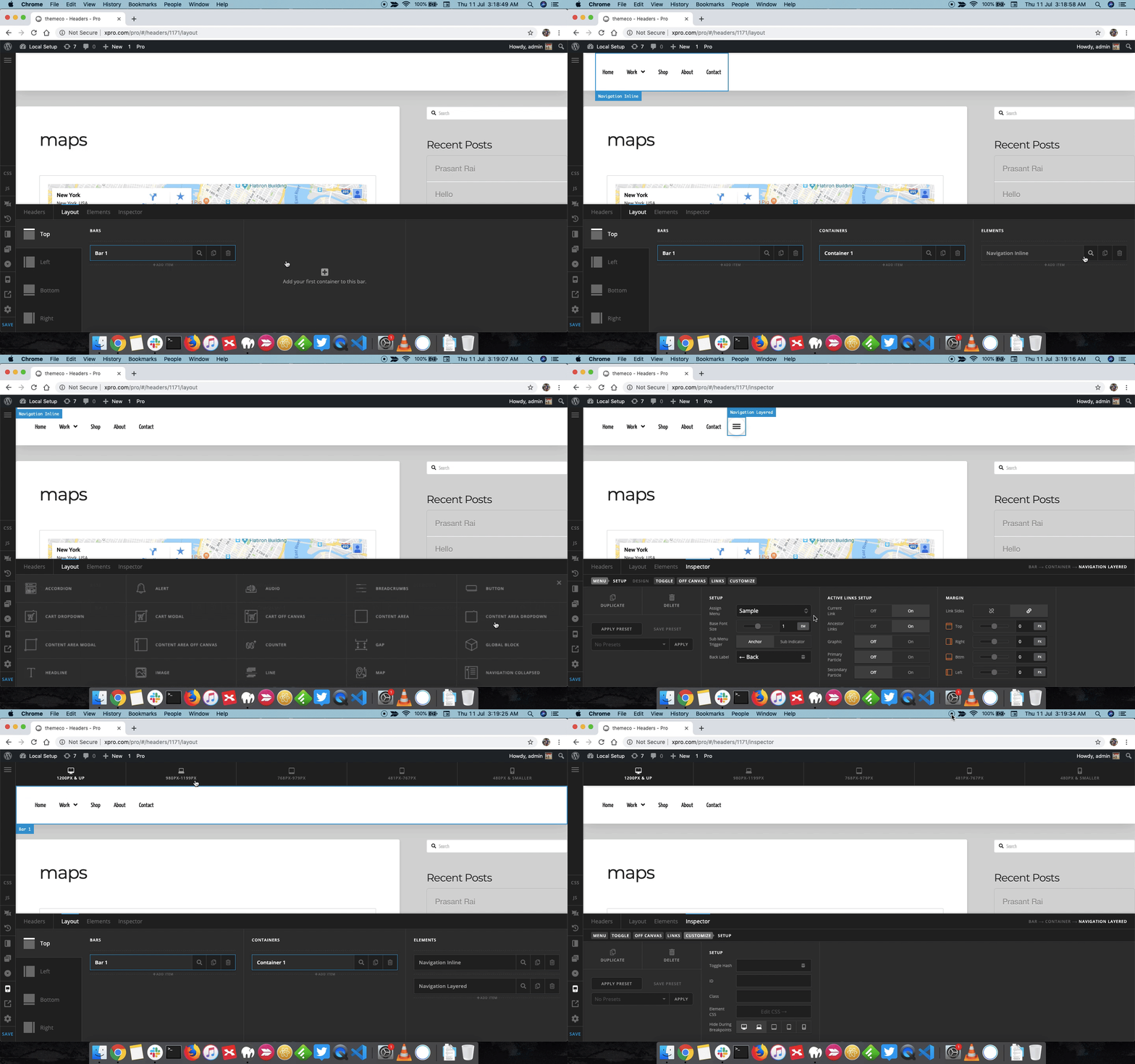
In the new website please inspect the Navigation inline element and under Customize > Setup > Hide During Breakpoints select Mobile and tablet icons so that the Menu is visible only on laptop and desktop screen.
Next, add the Navigation menu other than Inline Navigation and under Customize > Setup > Hide During Breakpoints select Desktop and Laptop icon to make sure navigation shows on only on mobile screens.
Here’s a screencast that you can take a look.
Thanks.
That’s perfect, works great! I could not for the life of me remember how I did that on my site. The only thing I’m not seeing is how to effect the X to close the open menu window. I want to make it have the same colors as the menu items.
Hello Kenton,
Thanks for writing in!
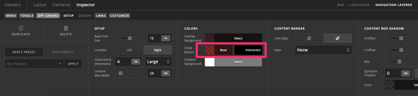
You can change the close button color under Off Canvas > Colors > Close button.
Thanks.
This topic was automatically closed 10 days after the last reply. New replies are no longer allowed.