Hi, what’s the best way to get the menu to shrink in font size for 980px-1100px and 768px-979px screens?
Should I rebuild it using a different set up for each screen or is there a way get the 1200px and up be responsive automatically?
Please see attached. 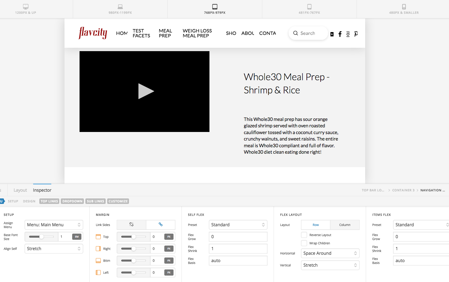
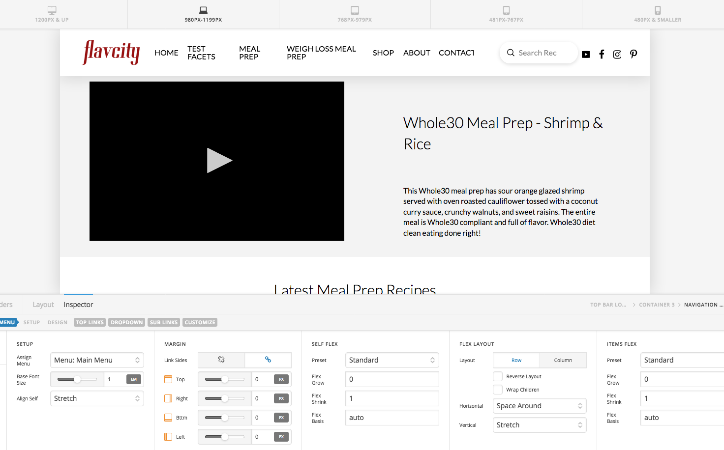
Thanks!
Hi There,
It could be done with the custom CSS. Please add the my-navigation CSS to your navigation inline element:

Then add the following CSS under Headers > CSS:
@media (min-width: 980px) and (max-width: 1100px){
.my-navigation.x-menu > li > .x-anchor {
font-size: 16px;
}
}
@media (min-width: 768px) and (max-width: 979px){
.my-navigation.x-menu > li > .x-anchor {
font-size: 14px;
}
}
But I would suggest you to hide the Navigation Inline on those screens size and show the Navigation Collapse, Navigation Modal or Navigation Dropdown instead:

Regards!
This topic was automatically closed 10 days after the last reply. New replies are no longer allowed.