Responsive Headline Sizing

Hey there,
I am using the Classic Feature Headline on my website.

website URL

https://www.intrapreneur.tools/

When I am viewing my site on a smartphone screen, the headline remains very big and does not fit the screen but rather gets cropped off by the right side of the screen.
Is there any chance, I can have the font-sizing being relative to the screen width? Where can I set this up? In the surrounding column or row?
Thanks a lot in advance,
Jean-Luc
Hi Jean-Luc,

Thanks for reaching us.

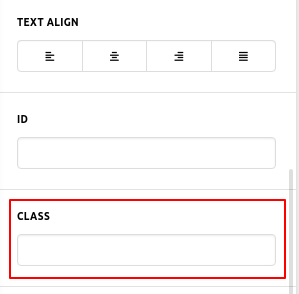
First of all, add a custom class like “myclass” in the class box of “Classic feature headline” element. Then add this custom CSS code in the X/Pro-->Theme Options-->CSS.

    @media(max-width:767px){
    h1.myclass {
    font-size: 150%;
    }
 }

Fell free to change the value of font size and you can also change the class name as well. please note that if you change the class name then you have to change the class name in the given custom CSS code as well.

aa-Content-Pro

The purpose of providing the custom CSS to show you how to add CSS code to your site. Writing custom CSS is outside the scope of our theme support. If you need more customization, you need to learn CSS and learn how to use the browser’s element inspector.

Hope it helps you.
Thanks

This topic was automatically closed 10 days after the last reply. New replies are no longer allowed.