Hi,
My colleague is currently offline and could not verify what he has done.
You just need to make sure you add a class to your headline and add that class as selector in responsive text settings.
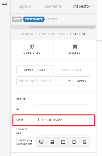
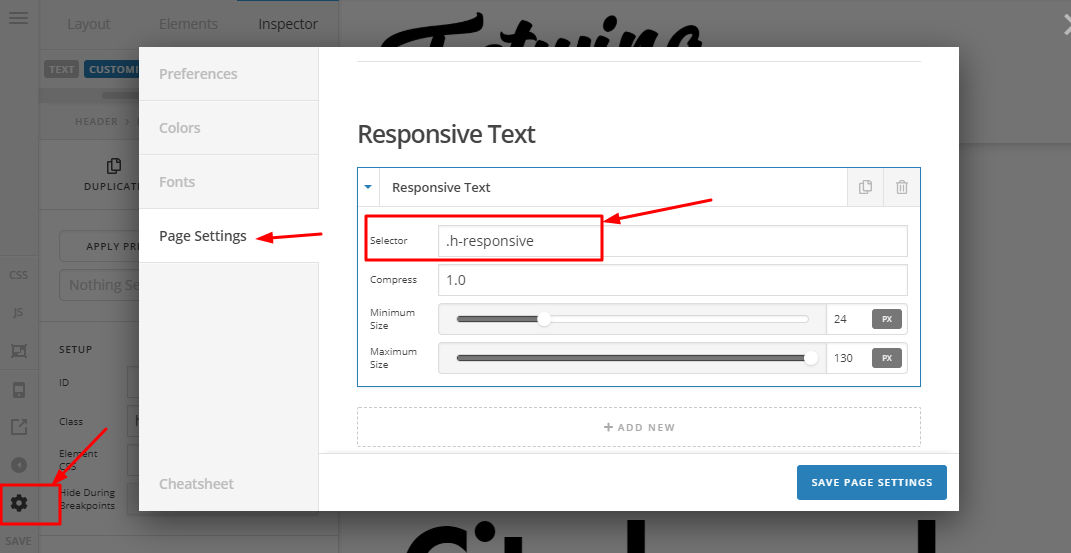
Please note the following
selector – Accepts a unique selector used on any text element that you want to be responsive.
compression – Set this to any number to alter the compression of how slow/fast your text responds as you resize the window. Start at 1.0 and make slow incremental changes to see what works best for you.
min_size – The minimum font size that you want your text to be. Accepts pixel units.
max_size – The maximum font size that you want your text to be. Accepts pixel units.
Thanks


