Hello,
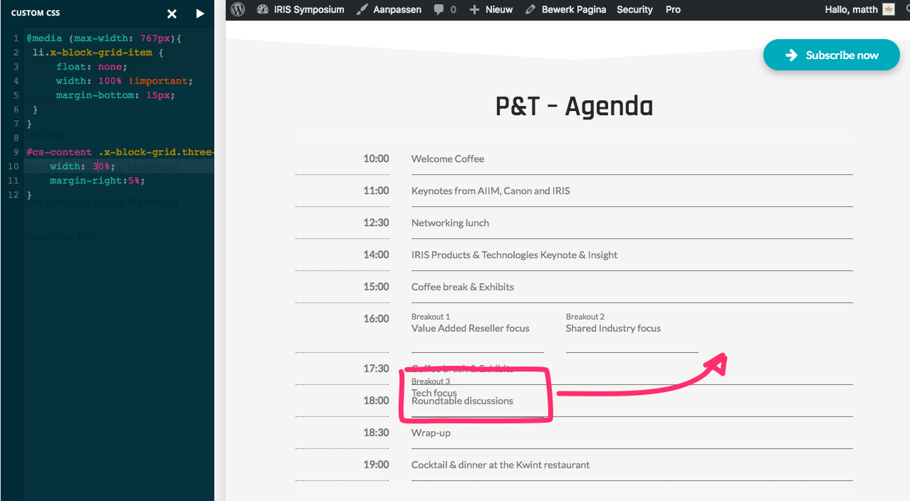
I would like to have my block grid less rensponsive. I mean on a Tablet in landscape I would like to keep my 3 columns. How can I fix this problem?
URL: https://irissymposium.be/home-pt/
Hello,
I would like to have my block grid less rensponsive. I mean on a Tablet in landscape I would like to keep my 3 columns. How can I fix this problem?
URL: https://irissymposium.be/home-pt/
Hi There,
Thank you for writing in! Do you mean on Tablet portrait view? Please add this on Pro > Launch > Theme Options > CSS
/* Portrait */
@media only screen
  and (min-device-width: 768px)
  and (max-device-width: 1024px)
  and (orientation: portrait)
  and (-webkit-min-device-pixel-ratio: 1) {
  	.x-block-grid.three-up .x-block-grid-item.mob-3column {
  		width: 30%;
  		margin-right: 4%;
  	}
  	.x-block-grid.three-up .x-block-grid-item.mob-3column:last-child {
  		margin-right: 0;
  		clear: none;
  		margin-top: 0;
   	}
}
Hope it helps,
Cheers!