Responsive and invisible table

Hi Team,

Do you have a code that I can use that would create a table that is also responsive to mobiles?
I tried this code but it’s showing the lines and also not looking good on a mobile.
Thank you in advance


Monday Tuesday Wednesday Thursday Friday Saturday Sunday
6-8am mysore style 6-8am mysore style 6-8am mysore style 6-8am mysore style 6-8am mysore style
9:30-11:30am mysore style
5-7pm mysore style 5-7pm mysore style 5-7pm mysore style 5-7pm mysore style

Hello There,

Thanks for posting in! Regretfully we do not have a table code that is very responsive and flexible. I would highly recommend that you use online table generators for best results. You might need to check out this link:
http://www.waystomakesite.com/2014/07/top-10-best-html-table-generator-tools.html

Hope this helps.

Thanks so much for the reply … I’ve created one and it looks fantastic on a laptop but isn’t responsive to a tablet or a phone… do you know if there is a code I can add to the CSS to make it responsive?

Thanks again I appreciate the help : )

Hi there,

Unfortunately, the table technology itself is not that much of responsive and regretfully it goes under the customization category which is outside of our support scope.

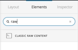
One thing that I suggest is that you add the Table code which you used from the online table generator and add it inside the Raw Content element in the Cornerstone and add it inside a section.

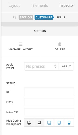
Then you hide the section for the tablet or mobile devices:

That will get rid of the table on small screens. Then try to find an alternative way such as the featured list or any kind of list and add it in a separate section. And this time hide that new section for laptop and desktop.

That will help you to show the information on mobile with alternative ways while maintaining the table for big screens.

Thank you.

1 Like

This topic was automatically closed 10 days after the last reply. New replies are no longer allowed.