Resize opened lightbox image (especially for phones)

Hi, the image lightbox seems to resize the images, based on the screen size. But on phones, the margin on each side is so big, that it doesn’t make sense to open it as a lightbox. can we fix this, so the images are larger?

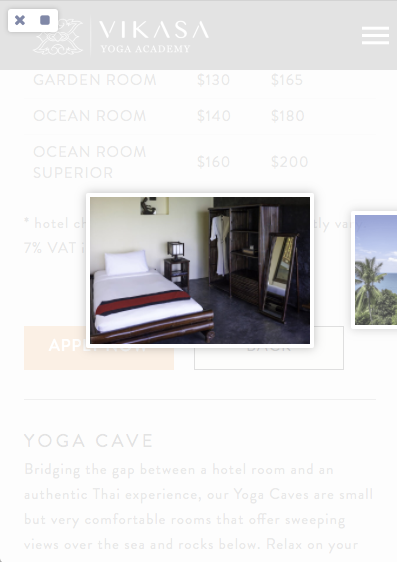
Here is how it looks:
How i want it to look:
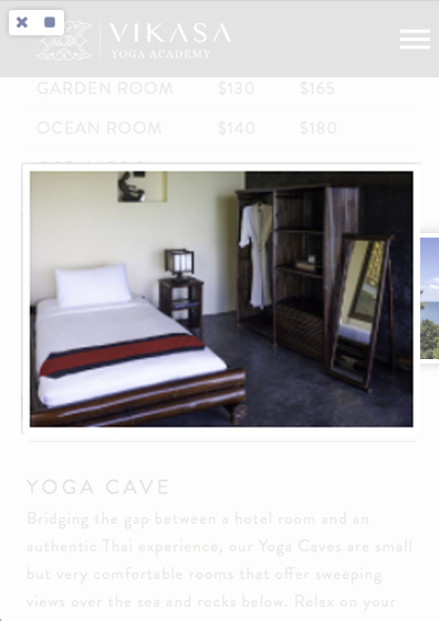
If it requires to remove the “next/previous” images and include the thumbnails, i’d be fine with that.

How is this possible?
http://projects.cornerstonetemplates.store/index.php/rooms-2/

Thanks in advance!

Hi there,

This code should get you started although you might need to alter it according to your needs:

@media (max-width: 480px) {
    .ilightbox-holder.ilightbox-next, 
    .ilightbox-holder.ilightbox-prev {
        display: none !important;
    }

    .ilightbox-holder div.ilightbox-container {
        width: 100% !important;
        height: auto !important;
        padding: 5px;
        background-color: #fff !important;
        -webkit-box-shadow: 0 0 15px rgba(0,0,0,0.25);
        box-shadow: 0 0 15px rgba(0,0,0,0.25);
        border-radius: 2px;
    }

    .ilightbox-holder {
        left: 0px !important;
        padding: 30px !important;
        background-color: transparent !important;
        box-shadow: none !important;
    }
}

Hope this helps.

Thanks, but the images scroll weirdly. :sweat_smile:

I think it’s because the images are now position behind each other. Is it possible either keep the next/previous elements and only change the size of the images, or position the next/previous outside of the screen? :slight_smile:

Thanks in advance!

Hey,

Increasing the image size, the next/previous will be removed and is necessary to hire a freelancer to edit the core to add it.