Repsonive Caption

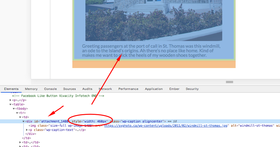
I am having a problem making the caption under a picture responsive. This is only a problem when i have two pictures side by side (using a table so they stay side by side when resized). Without caption text it works as expected. But the minute there is a caption there, it puts the picture in full size and when the two are side by side as they are in the table, they spill out of the container. You can see an example here.

Is there any code that i can use to fix this?

Thanks in advance,

Steve
Hello Steve,

Thanks for writing in!

It will always spill over the browser width because you are using tables. I would recommend that you use the classic block grid shortcode and then insert the image and its caption in each of the grid. You can check it out here:

Hope this helps.

Thanks RueNel. Yes, I might just have to use the shortcode. But if it will always spill over when using tables, why does it not spill over when there are no captions on the image?

Hey @eveall,

Thanks for updating in!

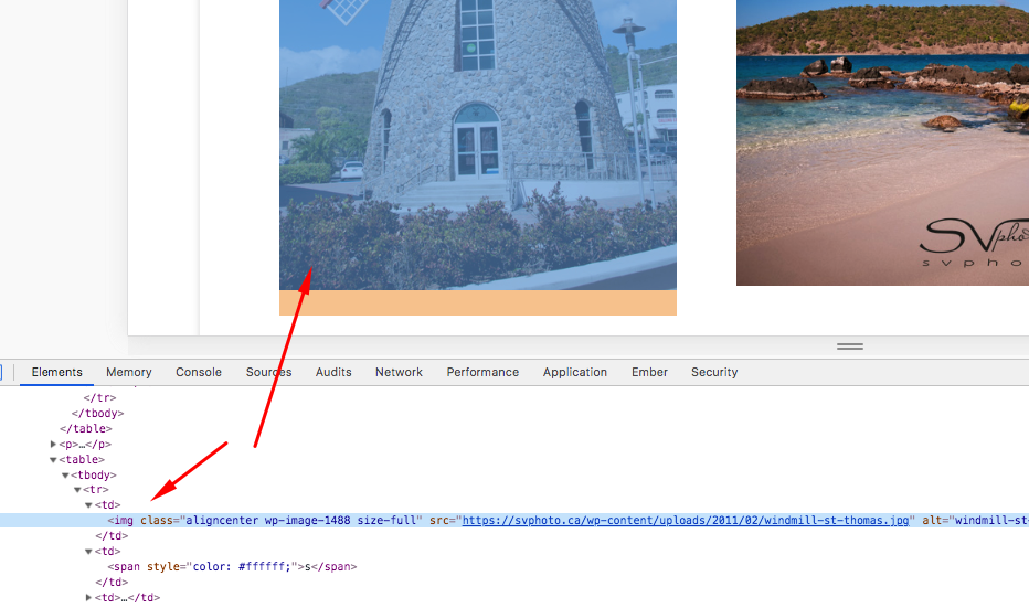
It does not spill over when there is no caption because only image element is displayed.

As soon as there is a caption, the image and the caption were wrapped with a div element that has a fixed width added to it.

Hope this helps.

This topic was automatically closed 10 days after the last reply. New replies are no longer allowed.