at my mobile breakpoint there’s a lot of excess padding added to the top of my pages.
for example, see this mobile view:

desktop view looks good:
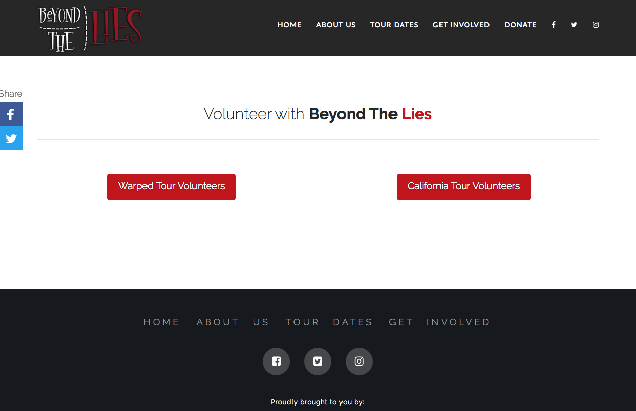
how can i keep this padding the same, regardless of screen size? thanks
at my mobile breakpoint there’s a lot of excess padding added to the top of my pages.
for example, see this mobile view:
desktop view looks good:
how can i keep this padding the same, regardless of screen size? thanks
Hi,
You can add two gap elements.
One big size and one with small size.
You can then set the gap with big size to be visible only in desktop and the small size to be visible only in mobile.

Hope that helps
that seems really clunky - why does the theme double the padding on mobile?
Hi @COK
The theme doesn’t double the padding value on mobile, it’s still 200px, the thing is the point where this 200px start, on desktop, since the top header position is “absolute”, the padding will start from the top of the page, on mobile devices, the top header position must be changed to “relative”, that’s why the padding will start from underneath the top header resulting in what will look like larger padding value.
What I suggest here is to add a custom CSS class to this gap element, check this screenshot:
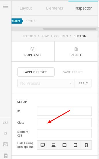
Then, you can add this CSS code to (Theme Options > CSS):
@media (max-width: 979px) {
    .x-gap.custom-css {
        margin: 100px 0 0 0!important;
    }
}
So that on mobile devices, this gap padding value will be switched to “100px” instead of “200px” and whenever you want to get similar effect, just add the “custom-css” class to your element.
Thanks.
Thanks, I’ll give this a shot.
You’re welcome, let us know how it goes.
Cheers!
This topic was automatically closed 10 days after the last reply. New replies are no longer allowed.