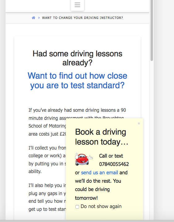
Remove white space above headline mobile devices

Hi

This is the page I need help with:

I’d like to move the headline at the top of this page up a bit closer to the top of the page when viewed on mobile devices.

Also, the text is not as responsive as I would like. I’d like to make it a bit bigger when I view the page on a mobile phone.

Thanks!
Hi Steve,

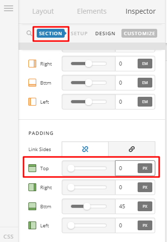
  1. To remove white space above headline, you need to set padding top of your first section to zero.

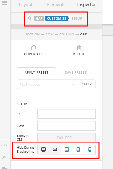
You can then use the gap element, to add space for desktop only.

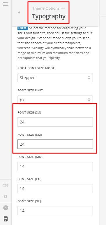
  1. You can adjust the text under Theme Options > Typography > Root Font Size

Hope that helps

Thanks!

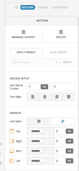
There doesn’t seem to be a ‘padding’ section, only ‘margin’:

And I don’t want to hide the headline on mobile devices, just make the white space above the headline smaller. If I select ‘hide during breakpoints’ will the section be invisible?

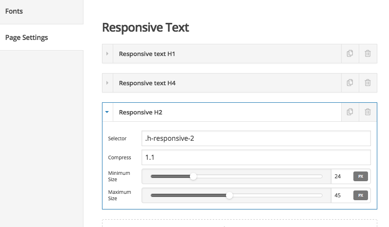
Finally, would any settings I select in the Typography section override the Responsive Text settings for that page?

Hello Steve,

  • You are not seeing the padding because you are using the basic mode. Please go to X > Settings > Permissions > User Preferences > Advance Mode and select “Always ON” so that all the settings like the padding will display in the inspector.

  • Yes the “Hide During Breakpoint” option will show/hide and element. Make the section always visible in all screen sizes. You can set your section to have a zero margin and padding. Use a gap element and show/hide it in different section to manage the space. To know more about this option, check this out: https://theme.co/t/hide-during-breakpoint-explained/17378

  • And yes the responsive text settings will resize the headline as long as you have used the correct selector and it will affect for that page alone.

Hope this helps.

That’s great, many thanks!

I’ve fixed the issues I had with that page now.

Just one more thing, I don’t want the content dock I use with most of pages to appear on mobile devices as it hides most of the content. But, as you can see, it does:

How can I fix this?

Hi There,

To hide the Content Dock on mobile devices, please add this custom CSS under Theme Options > CSS:

@media (max-width: 767px){
    .tco-content-dock {
        display: none !important;
    }
}

Hope it helps :slight_smile:

Brilliant!

Thank you very much :slight_smile:

You’re welcome!
We’re glad we were able to help you out.

This topic was automatically closed 10 days after the last reply. New replies are no longer allowed.