First, thanks for providing this great knowledge base and support forum! As a new user I have been able to find about 95% of the answers I need without having to post a question, and I have learned a lot in the process! Many of the questions that I still don’t have answers for seem to be as a result of the Theme’s styling that I don’t know how to access.
I learned in another thread how to reduce the padding in mobile menu sub-items:
body .mobile .x-nav li > ul a {
padding-top: 5px !important;
padding-bottom: 5px !important;
}
This worked great for the sub-items, but I would also like to change the primary menu items:
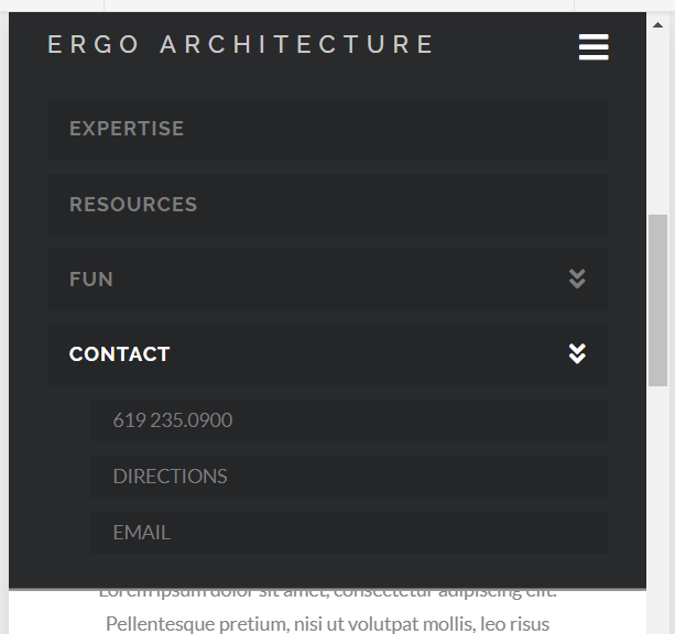
The three sub-menus have reduced height buttons due to the CSS above, but the four primary menu items above are still too tall. My specific question:
- How do I use similar CSS to reduce the padding on the primary items?
My more general question:
- Where can I find the CSS that X Theme uses to control menu bars (and everything else!) in the first place so I don’t have to keep bothering you nice people in support?
Thanks!
