On my “Contact” page I have the contact fields positioned exactly where I want them when displayed on a Desktop or Laptop or iPad. However, on my iPhone it looks like this:  I would like the fields to be positioned higher on this page so that the gap is closed. How do I do that without affecting the way it looks on other devices, or throwing off any other pages?
Hi Robert,
I have check and there’s few things I discovered.
Landmark is on. It displays breadcrumbs and title. It is behind the navigation with white font color because you do have fixed top Navigation. This is the root cause of the issue. See this: https://screencast-o-matic.com/watch/cqi0iuOw8v
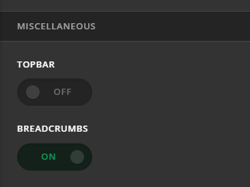
If page title and breadcrumbs is not intended, please turn it off here: Theme Options > Header > Miscellaneous. It will fixed the issue.
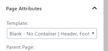
The default page template you are using on this page still has 2em top and bottom margin. If you don’t need that margin, please try other page template
Hope this helps.
This topic was automatically closed 10 days after the last reply. New replies are no longer allowed.