Hi, I’ve done my web and menu, on a computer it looks okay, the problem is when I open the web on an iPad (or any other tablet), the menu does not allow full page view, and, being sticky, It always happens (I add screenshot). I had thought that you could put the “hamburger menu” also in the tablet version, this would solve the problem. Another solution may be to disable the sticky menu for tablet, can these solutions be applied by code? I understand, but I do not know how to do it exactly. Thanks in advance.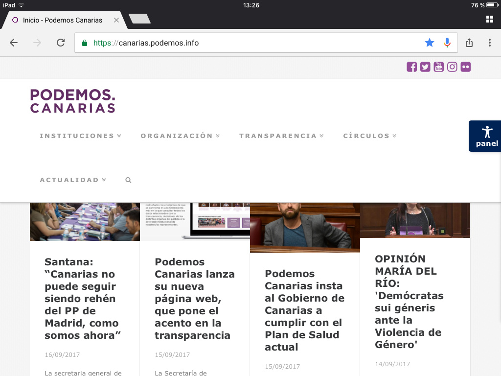
Hi There,
Please try adding the following CSS under Customizer > Custom > Global CSS:
@media (min-width: 980px) and (max-width: 1024px){
.x-navbar .desktop .x-nav > li > a:not(.x-btn-navbar-woocommerce) {
    margin-left: 0;
    margin-right: 0;
    padding-left: 10px;
    padding-right: 10px;
    font-size: 12px;
}

.x-navbar .x-container.width {
    width: 98%;
    max-width: 100%;
}
}