Hi Sebastien,
I can see it is now responsive. It is because of your FLEXBOX SETTINGS on your BARS and CONTAINER. Please check and subscribe to our youtube channel here. We do have 2 videos about flexbox Part 1 here and part 2 here.
Your default menu will not fit on small screen. Usually, we use Navigation inline in desktop and navigation dropdown on mobile. We implement that using HIDE DURING BREAKPOINTS settings That setting is available on BARS/CONTAINERS and all elements. See this: https://screencast-o-matic.com/watch/cq6vceuNm9
Another way to understand it is by following header or footer template. Please try to install it. Then check bar and container settings.
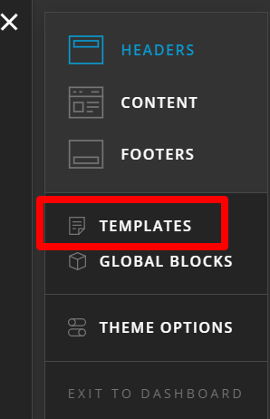
For templates to be available, you need to install it first from here:
Hope this helps.
