Problem with the error message

When a user doesn’t complete all the required info, there is a problem with the error message. It highlights the incorrect section needing to be updated, and the send button shifts to the right of the form. I didn’t test the forms yesterday, and I believe the Contact form was a plugin that was updated, so this very well could be a result of that update.
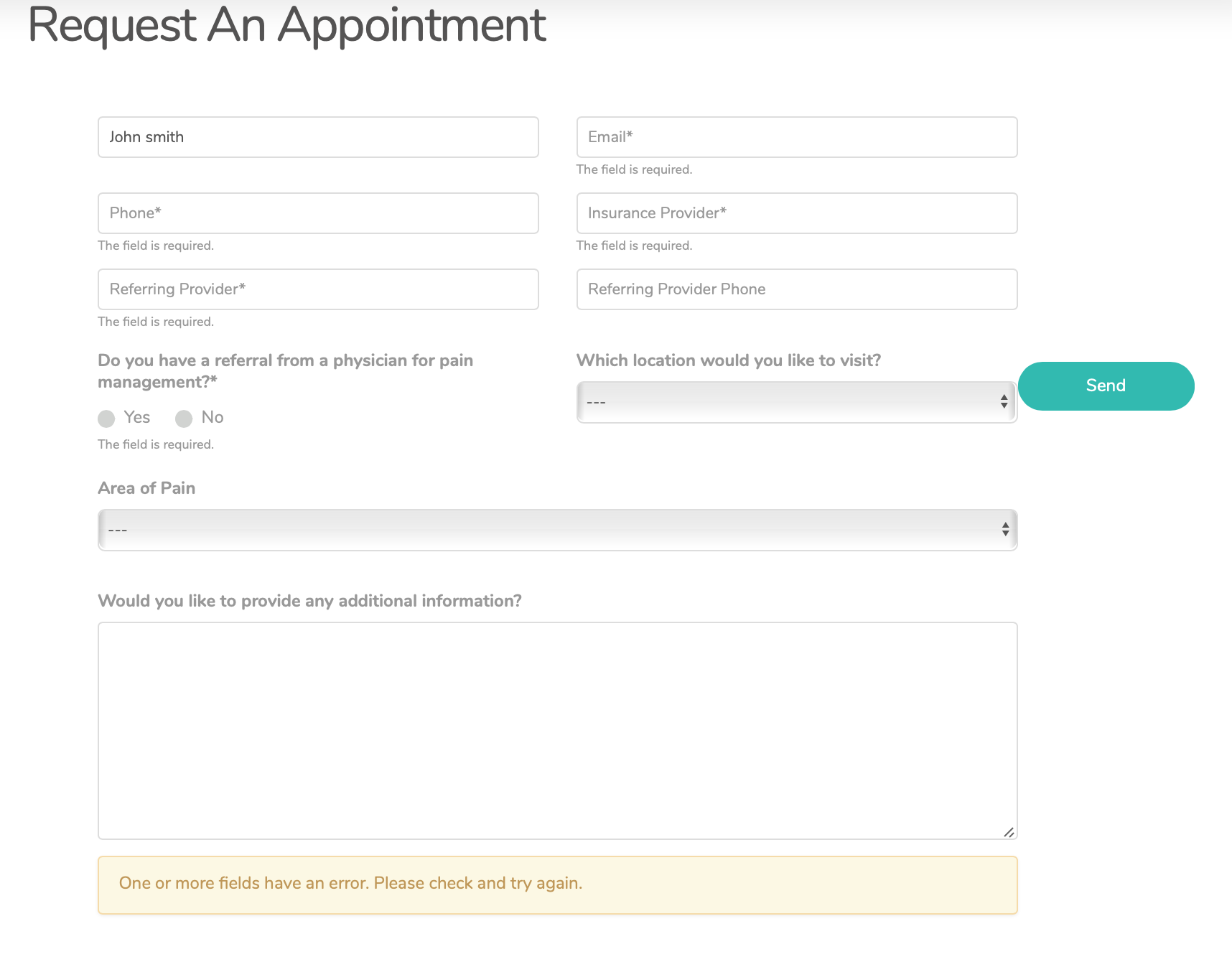
This happen after the pro update.

How do we fix this?

Hi Ali,

Thanks for reaching out.

It’s not because an update or plugin issue, it’s how you created your form content. Currently, you use the columns but you didn’t group each columns by row. Columns should be separated by row so it wouldn’t mix with other rows. For the meantime, please add this CSS to Theme Options > CSS as a quick fix.

    .areaSpaceLast + p {
     clear: both !important;   
    }

Thanks!

Thank you that worked.

You’re more than welcome, glad we could help.

Cheers!

This topic was automatically closed 10 days after the last reply. New replies are no longer allowed.