Hello!
Iam having trouble with Supafly.
I want a hamburger button on mobile, and the logo next to it.
But somehow the logo overlaps the logo on mobile, and i dont know how to fix it.
Can someone please assist me with how to fix this?
Hello!
Iam having trouble with Supafly.
I want a hamburger button on mobile, and the logo next to it.
But somehow the logo overlaps the logo on mobile, and i dont know how to fix it.
Can someone please assist me with how to fix this?
Hi @Stjarne,
Thank you for reaching out to us. I tried to find your site but you seem to have quite a few licenses registered on your account so I am not sure which website is in question. Can you please share the exact page URL so we can take a closer look? In the mean time please checkout it’s documentation and customization section here http://superfly.looks-awesome.com/docs/Customize/Customize_Appereance_on_Mobiles
Hope this helps!
www.molndalskliniken.se and the documentation is not helping Sorry.
I would like the navbar to be visible when scrolling on the page and fade away when still.
Hey @Stjarne,
Can we clarify some things first. Upon checking, I don’t see Superfly in the page and I see that you’ve hidden the Navbar in mobile view using custom CSS.

If you’ve hidden it because you want it to be visible on scroll, that is not optimal and also making the Navbar visible on scroll and hide it when still is also not a feature offered in our themes. It could be possible with custom development but that would be outside the scope of our support.
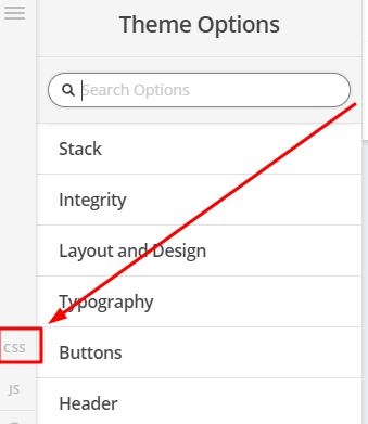
If you’re problem is the stacking of the logo and menu in tablet view, you will need to downsize your logo in Theme Options > Header > Logo - Image > Logo Width. Your logo is 500px. Please try setting the Logo Width to 300px.

Thanks.
UPDATE: It’s weird that when I reloaded the page, Superfly displayed so it looks like you’re currently working on your site?
Anyway, I saw the issue you’re referring to and you will need to override the #sfm-mob-navbar img's height and margin-top in the screen size you’re having the issue. Below is a sample CSS to
be inserted in Superfly’s Additional CSS box. Please note that this is a sample. You will need to learn or understand CSS in order to tweak it to achieve your desired outcome. See https://youtu.be/-PX2SgLmJTs
@media screen and (max-width: 480px) {
#sfm-mob-navbar img {
    height: calc(3vw + 10px) !important;
    margin-top: calc(1vw + 13px) !important;
    margin-left: calc(6vw + 30px) !important;
}
}

You can learn CSS from sites like https://www.w3schools.com/
Hope that helps.
Thanks alot for the answer you provided. Iam not currently working on the site.
The navbar is hidden only when mobile is showing, didnt find an easy way to turn X navbar off by default and only use supafly, somehow i had 2 navbars.
Its the navbar only on mobile thats troubling me atm. But now its fixed with the CSS provided and some modifikation.
Though now i got double menus in Ipad. I would like to have supaflys menu on Ipad with logo in center. Do you know how to fix that?
It’s showing both the Superfly and X navbars because of breakpoint mismatch. Remember that you’re using 979px breakpoint to hide the X Navbar and your Superfly Mobile Navbar is displayed starting from 768px. Both must be set to the same value.
Tablets and Phones also both have a portrait and landscape orientation. Commonly, the portrait orientation is 768px in width and the landscape orientation is 1024px. If you want to display the Supefly Mobile Navbar in tablet landscape, you should set the Threshold Point to 1024.

Do the same for your custom media query that hides the X Navbar. Change the current 979px to 1024px.
Thanks.
Thanks alot for the reply!
It seems like that made the trick, with one exception. Now on my ipad theres a big white line under the navbar. It wasnt there before, can you see it aswell?
You’re welcome, Stjarne.
I updated my reply above yours 
It’s because the Navbar’s wrapper has the height. It would actually be best to target the whole header in general.

In your code, change .x-navbar to .masthead.

Hope that helps.
Hello!
Thanks for all the assistance so faar.
The menu is working superb right now!
Though i got another problem now instead, when you go to https://www.molndalskliniken.se/kontakta-oss/ and scroll down to the employes and tilt the screen on an tablet they scale up like the image :

How to solve that?
Hi,
You can make it one column in smaller screens as it doesn’t fit well.
To achieve that, you can add a unique class to that row element,

Then add this in Theme Options > CSS
@media (max-width: 979px) {
.employees  .x-column.x-sm {
    float: none;
    width: 100%;
    margin-right: 0;
}
}
Hope that helps
This topic was automatically closed 10 days after the last reply. New replies are no longer allowed.