Problem with responsive text

Hello,

The responsive text seems to not be working on my blog (for example: https://neomedia.io/blog/booster-publications-facebook/).

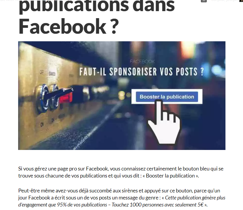
Looks good on desktop:
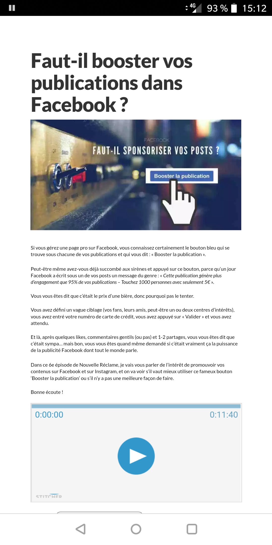
But here’s the look on my phone (Android). Looks the same on a friend’s iPhone that I just checked:
Can you help?

Thanks in advance!

Joseph

Hi There,

Please try adding this custom CSS under Theme Options > CSS:

@media (max-width: 767px){
    .single-post h1 {
        font-size: 26px;
    }
}
@media (max-width: 480px){
    .single-post h1 {
        font-size: 18px;
    }
}
@media (max-width: 320px){
    .single-post h1 {
        font-size: 16px;
    }
}

Hope it helps :slight_smile:

Thanks for your quick response.

I did that, but unfortunately the text is still really small on mobile.

Hey @donyo,

I believe you’re referring to the content?

The code given by @thai won’t work as that targets h1s only. And, you don’t need CSS to fix this.

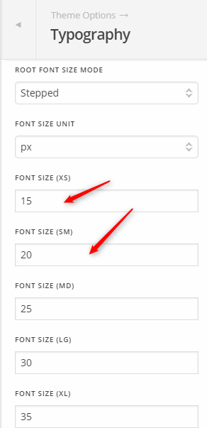
First, please go to X > Theme Options > Typography and check the Font Size XS or SM if they are set to 6px.

Try setting XS to 12 and SM to 14.

If that does not help, please give us WP Admin in a Secure Note so we could give you a proper advice without custom coding.

Thanks.

Now it works, thanks Christian!

Do i need to remove the CSS code that i added after Thai’s answer?

Hey There,

Yes you may remove the code given by Thai because it is meant to change the font size of the h1 title in your post. You may not remove the code if it also helps and that you want the post title to become smaller in smaller screens.

Best Regards.

This topic was automatically closed 10 days after the last reply. New replies are no longer allowed.