Problem with fixed top header on display with 1199px

my problem ist that the header shrink when i scroling on a display with 1199px.
my eglish is not good sorry for that.
i have make screenshoot that show the problem
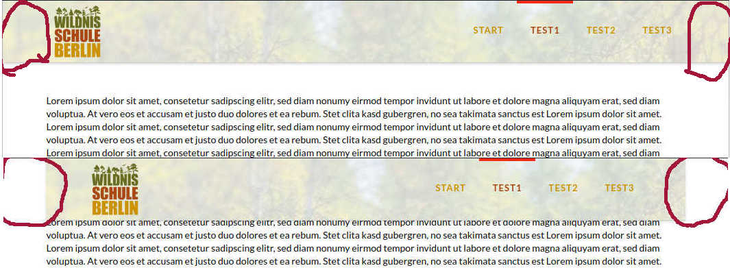
a second problem is on mobile device the header not fixed on top.

thank for your help

Hello There,

Based on the screenshot, do you have a custom css added to make the navbar fixed? This should not be happening if you are using the default settings or with Pro’s custom header builder.

To assist you with this issue, we’ll first need you to provide us with your URL. This is to ensure that we can provide you with a tailored answer to your situation. Once you have provided us with your URL, we will be happy to assist you with everything.

Thank you in advance.

Thanks for the reply, currently the header is not fixed with additional css.
I had the header with time

@media (max-width: 979px) {
.x-navbar-fixed-right, .x-navbar-fixed-right, .x-navbar-fixed-right {
position: fixed;
}
}
extended thereby it would remain fixed for mobile also.
but this has no influence on the problem with the shrinking of the header when scrolling with a resolution of 1199px.

the url is:

Hello There,

Please remove this code:

.x-navbar.x-navbar-fixed-top.x-container.max.width {
    width: 88%;
    max-width: 1200px;
}

And replace it with this code instead:

body .x-navbar.x-navbar-fixed-top.x-container.max.width {
    width: 100%;
    max-width: 1200px;
}

We would loved to know if this has work for you. Thank you.

that works perfectly. Thank you

Hey,

You are welcome!

This topic was automatically closed 10 days after the last reply. New replies are no longer allowed.