Pro Theme Header Menu Layout

For some reason my header menu has started stacking into multiple lines. For example Special Events is on 2 lines not 1.

What I want to be able to do is put this back so they are in one line and also so the menu isn’t larger on the screen on smaller laptop screens (15")

Website - https://mickleyhall.com/

Thanks
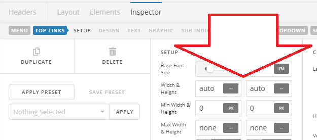
Hi @robbo651,

Thanks for reaching out.

It’s due to 90% max-width applied to reach menu item. The flex layout automatically distributes the dimension for each item depending on its content, then you set it to 90% which makes it less 10% than allocated.

It’s only good for items with large dimensions, please set it back to its default values.

Cheers!

Great thanks :smile:

Do you know what I need to do so the menu doesn’t go wider than the page on smaller laptop screens?

Hi @robbo651,

This particular situation is simply a matter of reworking your content to properly fit the physical limitations presented by the theme (this is a consideration that must be taken into account with all themes and designs). It is the same principle applied to fill up a room with furniture—there is only so much that can fit into a given space. The following should be considered in these situations:

  • Shorter Names – you should always shoot to have your top-level navigation links be as simple as possible. For example, if your link is “Learn About My Company,” Try using “About” instead. It conveys the same idea and will save you a ton of real estate.
  • Rearrange – sometimes we want to put all of our links in the top-level navigation, but not all pages are created equally. Pages of lesser importance that pertain to a parent link might work well as a sub-menu instead.
  • Less Links – even on more “complex” websites with lots of pages, there are always ways to combine information together to make things simpler, which also ensures that your user doesn’t have to click around for every granular piece of information. For example, you might have two top-level links called “About” and “Contact,” which could possibly be combined into one. This eliminates the need for extra links and makes things much simpler for your users to navigate. Less is more in information architecture.
  • Appearance – fortunately Pro/X features plenty of options for adjusting the appearance of elements throughout your site, and the navbar is one of the more flexible elements. Try using a smaller font size if possible to save on a little real estate.

Thanks!

This topic was automatically closed 10 days after the last reply. New replies are no longer allowed.