Hi,
After the last update to the Pro theme, the navigation menu toggle width is truncated on mobile.
Hi,
After the last update to the Pro theme, the navigation menu toggle width is truncated on mobile.
Hello @speckz,
Thanks for writing in!
Please edit your header and make sure that the Self Flex option in your Flexbox layout is set to ""Fill Space Equally’.
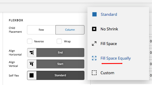
Hope this helps. Kindly let us know how it goes.
Thanks, @RueNel! However, it ended up being the Width and height under “Setup” for the menu toggle. It was set to 0. changing this to 1 EM fixed it.
This topic was automatically closed 10 days after the last reply. New replies are no longer allowed.