Pro Mobile header alignment

Hi There please could you help.

I have just finished a website and I just cannot get the header to sit correctly on all sizes except large.

Tearing my hair out as used this template header before BUT I just cannot get it working right except on a big screen !

Details below

Thank you so much

I think I have managed to sort out the ipad size but please could you look at the mobile and in between mobile and ipad size.

Thank you soooo much

Hello Eileen,

Thanks for writing in!

Please create and design different bars that will display in specific screen sizes. You can utilize the Hide During Breakpoints option in the Customize tab of the bar settings. At the moment, you only have created for the desktops and for smaller screens. Please also consider designing a bar exclusively for tablets and iPad screens.

Hope this helps.

Thanks. I have added another bar but its all a bit of a fiddle getting pro headers to work correctly on all sizes!

Kind regards

Hi Eileen,

You are getting there.
I can see you have 2 bar. Mobile and Bar 1. Rename Bar 1 as Desktop. Inspect it, on Customize Tab, Hide this on the 2 small screensize opposite settings of your current Mobile. No need to hide your logo inside this bar on small size because it is already applied on the bar.

Next, on the first bar named MOBILE, build the header as you like it on Mobile view. HIDE DURING BREAKPOINTS are correctly set. You may add another container. To make container fullwidth, set the following settings:
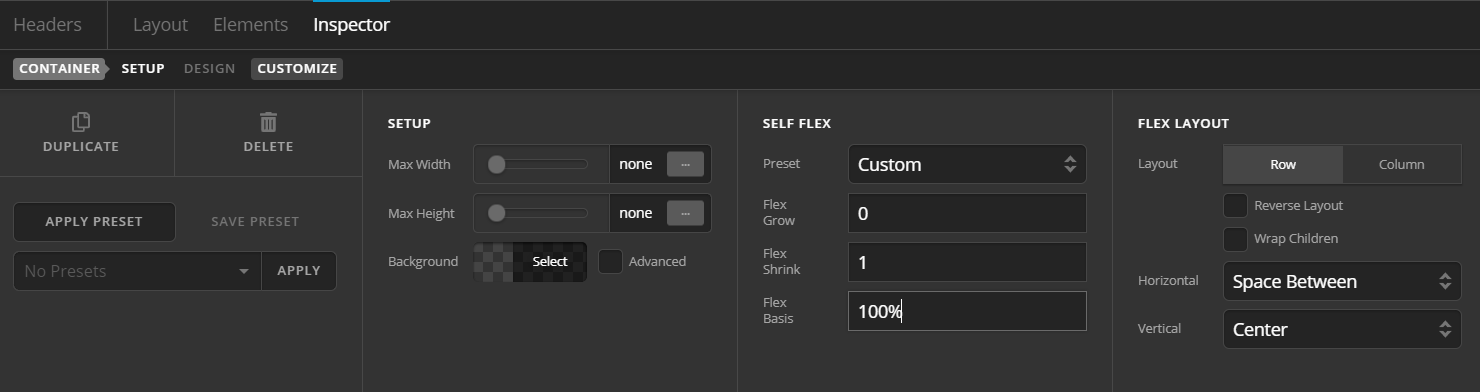
Now you have 2 container here, the first has LOGO, then on the next, put the element as you like.

Hope this helps.
This topic was automatically closed 10 days after the last reply. New replies are no longer allowed.