I am having an issue with the second bar I have created specifically for mobile and tablet viewing.
Once you scroll down the page a “gap” appears between the top of the page and the second bar.
any suggestions?
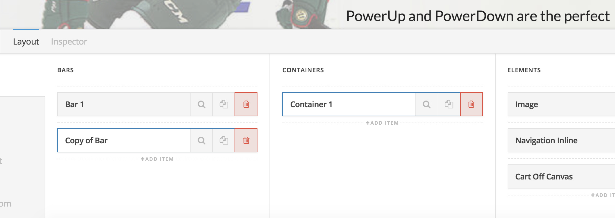


I am having an issue with the second bar I have created specifically for mobile and tablet viewing.
Once you scroll down the page a “gap” appears between the top of the page and the second bar.
any suggestions?
Hey there,
I checked your site but I don’t see the gap. Did you change the setup?
Thanks.
Yes, I changed it.
I removed the additional bar and instead added another container that is only visible on mobile.
I wanted to do this as a quick fix until I knew what to do about the additional bars.
The 2 bars were perfectly stacked when the page loaded.
Once you started to scroll down and the shrink option started to work, the bar would move down and there would be a gap above it.
Do you know if this is a common issue?
Hi There,
This happens if you have 2 sticky bars, even if one is for desktop another for mobile.
If you want to have this design, please provide your URL with the buggy design and we can provide you CSS fix.
Thank you
This topic was automatically closed 10 days after the last reply. New replies are no longer allowed.