Pro Header Split Menu - Not Responsive

Hi

I’m having issues with my menu, in pro. It’s a split menu with a logo in the middle from a pro header template. But it’s the links are shrinking when the screen gets smaller. It works for mobile, but has issues between full screen and ipad sizing.

Please help.
Hi Alexandria,

Thanks for reaching out.

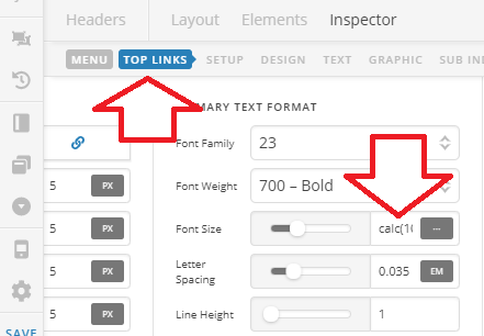
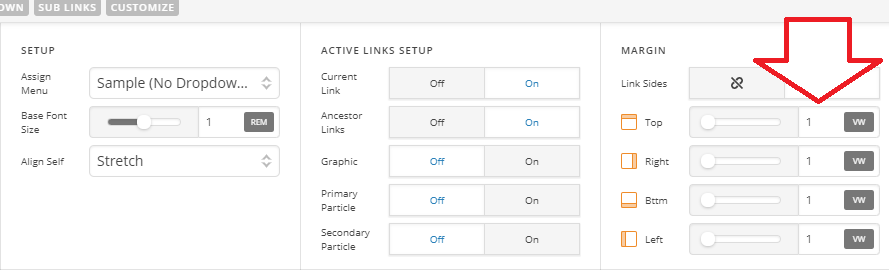
For that, I recommend displaying mobile menu earlier (like on iPad). Or make the menu spacing and font size responsive. Example,

Using this calc(10px + 2vw) as font size value. You can play with the values until you find the perfect fit for your preferences. But due to very long header, I think changing them won’t be enough as it’s too wide. I recommend removing some menu items as well.

Thanks!

This topic was automatically closed 10 days after the last reply. New replies are no longer allowed.