Hi @mickna,
Thanks for reaching out.
You could try changing your menu font size using calc(). Example,
font-size: calc(10px + 4vh);
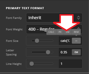
The 10px is the base font size, while the other is the size to respond to. The VH is applied so it will respond to height change, then VW for width.
The spaces (padding and margins) are also fixed values (not changing) so you may change its values the same as calc() + VH so it would also respond to screen height. Responsive text isn’t enough, the spaces should change too.
As for the close icon, it seems not possible since the two are on different containers that responds in different size (header bar has inner container while the modal is full-screen with absolute position). I tried it and works on my current screen, checked and resized it and they aren’t aligned anymore.
Thanks!
