Pro: Header & Footer adjustments /issues mobile tablet

Hi there,

I played a lot around but cannot seem to find the right setting for the following issues. The footer issues are especially visible on mobile-tablet.

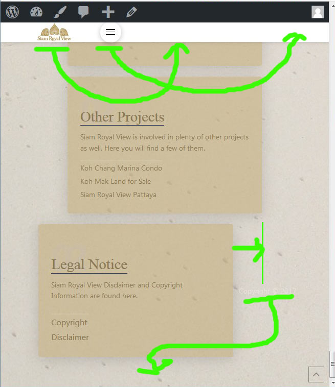
  1. put my header-logo centered on mobile view.
  2. navigation burger move to the right
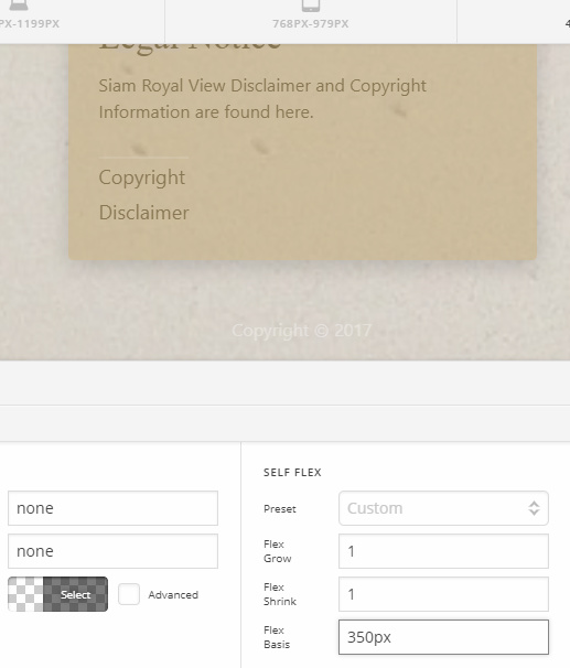
  3. footer: I have a hard time to get my 6th column in the footer (legal notice) in one line with all the others. (this you can see on tablet. On phone the screen is narrow so it is ok.
  4. footer: small “copyright 2017” notice moved beside the “6th column” (can see in screenshot)

Thank you in advance very much!!
Hey @Maik,

  1. Set your container’s max width to auto and set the horizontal flex layout to end.
  2. Set your container’s self flex to fill space.

Watch this screen recording to see how it works.

3 and 4. Set your container’s (containing the copyright text) self flex setup the same as the other containers.

Hope that helps.

1 Like

Hello Christian.

Thank you very much for the explanation and the VDO.
At first I thought it’s perfect, until I clicked on the “non-mobile-screen-sizes”

Because we set up the logo in the middle container to be “end” there was a long space between the left menu/container and the logo/container on desktop view.

So it looked all good on mobile but not on normal pc screen.

I changed the container with the logo from “end” to “center” again and now it looks good on pc-desktop
But on mobile view the logo is not centered. It is too far left.

Is it not possible to make the logo centered on both, desktop and mobile?
Please help.

  1. and 4. Setting the containers self-flex setup the same as the other containers was the first thing i checked. Actually I just copied the containers in the first place, so settings should be same anyways.
    But. It didnt work. Please help.

Thank you for looking at this again.
Its almost good now.

Best regards

Hi There,

Please add another container that is hidden on Desktop view. This time choose end on Horizontal view. Then logo container that you have at the moment that displays fine on desktop should be hidden on mobile view. This 2 container then with different position of the logo will switch per screen size.

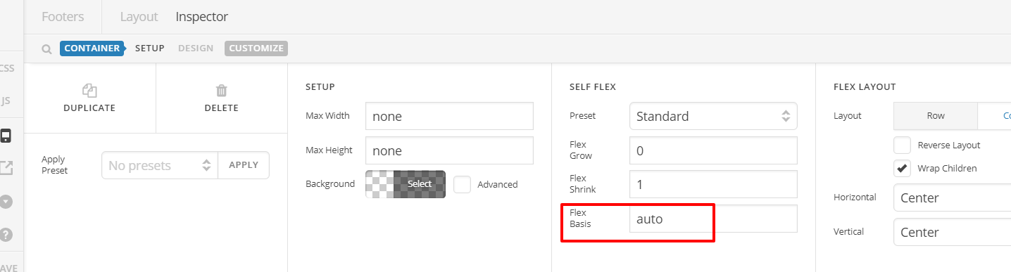
For the footer, add Flex basis value too same with other Container:

Others are set to 360px while that last one is set to auto.

Hope this helps.

1 Like

@Lely

thank you so much!
You’re awesome.
It worked perfectly.

There are so many settings in the header and footer builder that it is difficult to compare them all.
So I missed that little Flex Basis 360px thing…
Now it looks awesome!

Have a great weekend!

Glad it’s okay now and you’re most welcome!

1 Like

This topic was automatically closed 10 days after the last reply. New replies are no longer allowed.