Hello Support,
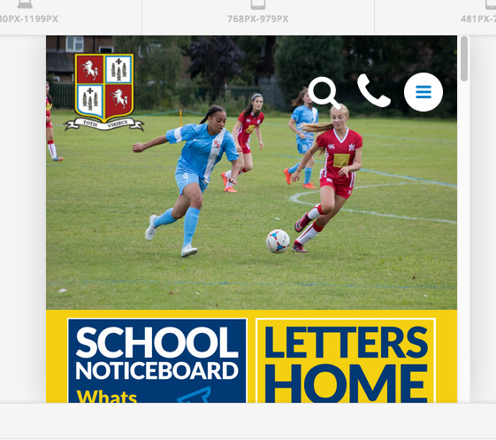
I have been using your Header builder in Pro and am quite pleased with the header, except when the header scales to the smallest size: “480px-smaller”
As you can see from the screenshots the header works fine at: 1200px:

and at 1080px-1199px:

and at:
768-979px

and also at:
481-767px

but at the smallest size “480px-smaller”, which effects the site when viewed on a mobile phone the elements overlap one another and I can see I have space either side (shown by the blue frame). I have tried changing the flex layout horizontal settings and thought “Space between” would fix the issue, with no luck. Can you offer any advice? The url to view the header: http://www.erith.kent.sch.uk/navigation-new2/
Many thanks
Ashley