Pro Columns Not Breaking

Hey Guys,

I’m trying to figure out why this 2-column row is not breaking at smaller screen widths… The other rows on this site/page are working fine - I’ve played around with it for quite a while - I’m sure it’s something simple:

https://mwm-systems.com

Any help would be appreciated - Thanks!

Hi @jonathanrockett,

It is breaking here for me though it is on smaller screen only: https://screencast-o-matic.com/watch/cq6jlRurpD

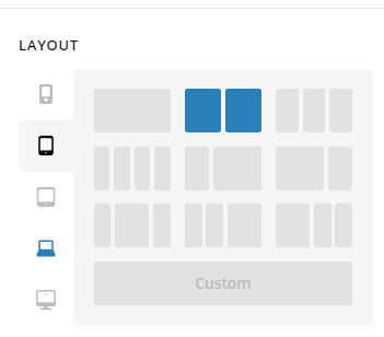
Please inspect ROW. We have 5 responsive breakpoints. You can see it was represented by 5 screen icons in there:

You have correctly set the smallest to have 1 column. Please do the same(choose one column too) on the next responsive breakpoint from mobile.

Hope this helps.

So dumb of me! Got it :slight_smile:

Is that ‘layout’ module new with 3.0? I haven’t noticed it before…

Thanks again for the help!

Hi @jonathanrockett,

Yes the layout module is included in the new release.

We are glad that @Lely was able to help you out. Have a great day!

This topic was automatically closed 10 days after the last reply. New replies are no longer allowed.