Hi @Woordenaar,
You have a specific use case that none of our Navigation elements support and you need to add custom CSS to achieve the feature that you want.
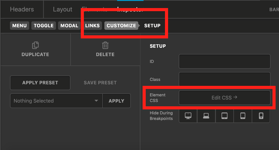
Please kindly go to Navigation Modal element that you used for the mobile menu and click the Customize tab and select the Element CSS option and add the CSS code below:
$el li.secnav a .x-anchor-text-primary {
    font-size: 0.75em !important;
    color: rgba(255,255,255,0.4) !important;
}
You already added the secnav class and I made use of that in the suggested CSS code. The $el represents the Navigation Modal item wrapper.
The code above is a suggestion for you to get started with your customization. This is not part of the original theme features and full implementation of what you want is outside of our support scope.
Thank you for your understanding.
 This worked perfectly…