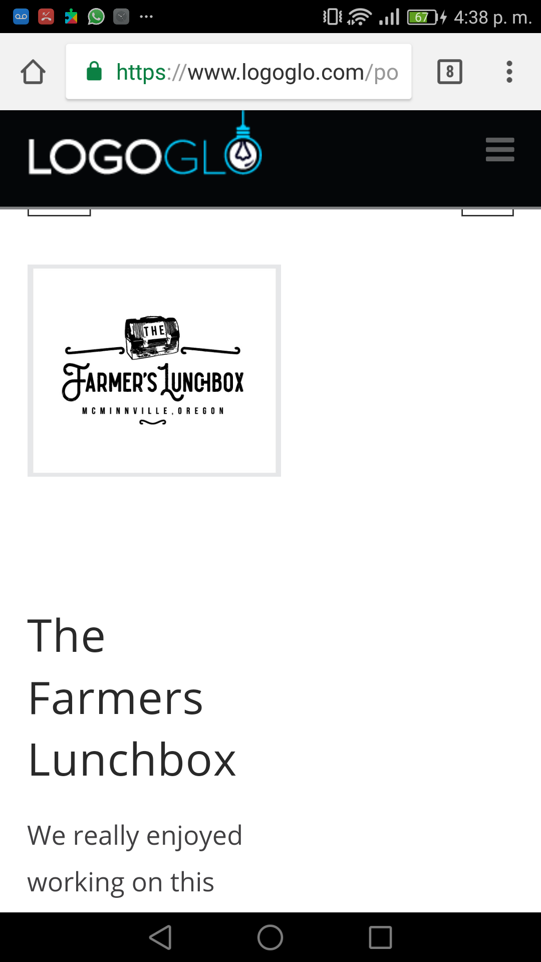
Hi, check out the index page on a mobile device:
And individual portfolio items:
2 things.
1: on the index page, the top image is sitting underneath the menu (I dont want the menu to change, I want it to be like this) Any way I can move the portfolio index content down a little so its not hidden by the menu?
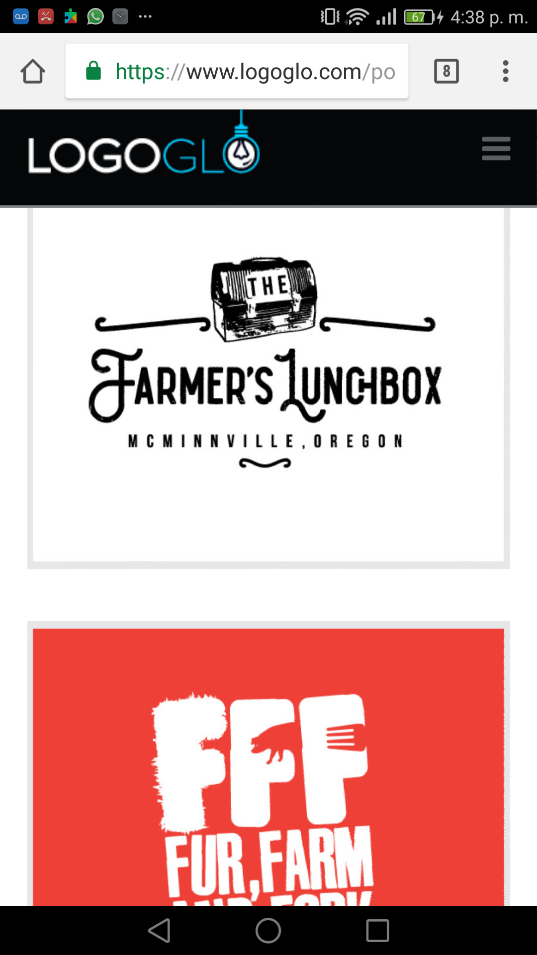
2: same on the individual items. So the nav of the portfolio is hidden, anyway we can move it down a bit?
3: I dont like how the layout looks, is there a way to make the image bigger, to fill the mobile screen, then have the rest of the info below it?