Hi,
It’s nice to have the pictures align, see attachment. How can we make this also align
in different (smaller) sizes responsive?
Carla van den Ouweland
Hi,
It’s nice to have the pictures align, see attachment. How can we make this also align
in different (smaller) sizes responsive?
Carla van den Ouweland
I’ve checked your website and I suggest adding a custom CSS class to this row showed in the screenshot:
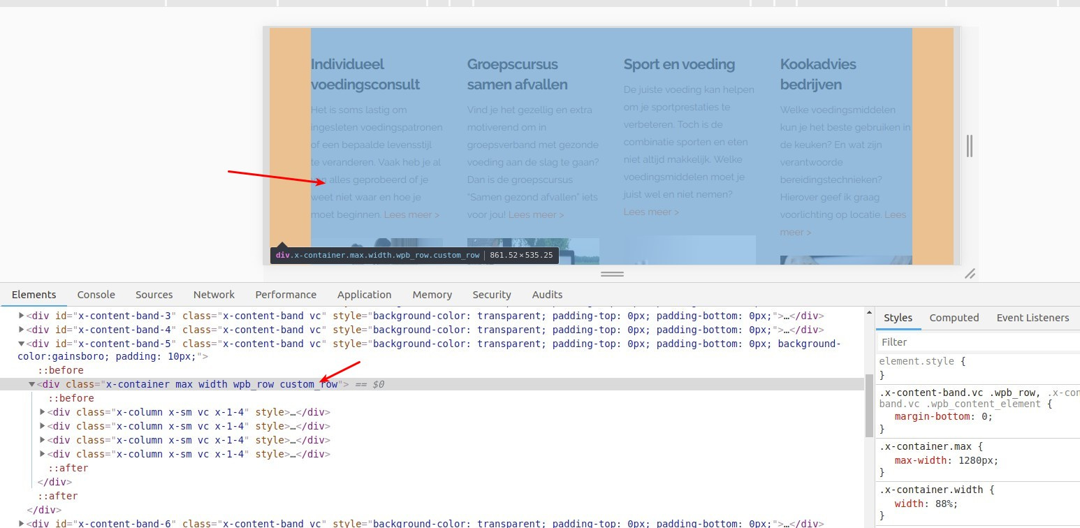
Then you can add this CSS code to (Theme Options > CSS):
@media screen and (max-width: 1500px) and (min-width: 768px){
    .custom_row .x-column h5 {
        min-height: 70px;
    }
}
@media screen and (max-width: 1500px) and (min-width: 1200px){
    .custom_row .x-column p {
        min-height: 170px;
    }
}
@media screen and (max-width: 1200px) and (min-width: 980px){
    .custom_row .x-column p {
        min-height: 200px;
    }
}
@media screen and (max-width: 980px) and (min-width: 768px){
    .custom_row .x-column p {
        min-height: 275px;
    }
}
To know how to add a custom CSS class to your row, please check this screencast:
Thanks.
This topic was automatically closed 10 days after the last reply. New replies are no longer allowed.

