Parallax Settings in X-Pro

I’ve searched the forum for answers to this, but cannot seem to find the answer for the effect I am trying to get (same as link below).
https://www.w3schools.com/howto/tryhow_css_parallax_demo.htm

In the W3 example (and others I’ve seen) have the background image fixed; it does not scroll up, while other components move up to reveal another image. None of the settings I’ve tried seem to give this effect.

Hi @mcaravaglia,

Thank you for reaching out to us. To enable the parallax effect, inspect your Section in Cornerstone/Content Builder and turn on the Background Advanced settings (see screenshot)

image

Now Under Background Lower Layer or Background Upper Layer choose the Type Background Image and turn On the Parallax option (see screenshot)

image

You can adjust the parallax settings as you need. Hope this helps!

Nabeel,
Thank you for your reply. The screen captures you used are from the latest version of X-Pro and the site I am working on is vers. 3.2.3 which is quite different. Still, the settings are pretty self-explanatory, but I still cannot find any way to make the background static, so it doesn’t scroll up. I was able to get the effect using CSS, but I could not get it to work using any of the settings as you describe.

Hi @mcaravaglia,

I would suggest you use the settings described by my colleague in his post, please find the screenshot for the same from the 3.2.3 version.

Hope it helps.
Thanks

I’m sorry Tristup, but this does not help. If I follow these settings exactly, it does not seem to work; OR, I just don’t understand. To begin, in your screen captures, you are not showing which layer to enable for Background Parallax. Do I check the upper layer, the lower layer, or both? I assume I would select the Lower Layer, however, I have tried all three options and the results are the same in each. In addition, these settings render the background image as a small strip, with a very narrow height, as in the screen capture I attached below. I can add padding top and bottom and then it becomes larger, however that affects the focus of the image, making it zoom much larger than I want. Also, the background image does not remain fixed.

Also, if an image goes into the Lower Layer, and nothing goes in the Upper Layer, than what is the upper layer for?

Again, no matter how I apply these settings, I cannot get the effect as in the link below by using any of these settings. If you can view this link and provide specific settings to render this affect, I would be grateful; but I see no way to do this by using the Parallax features as described.

https://www.w3schools.com/howto/tryhow_css_parallax_demo.htm
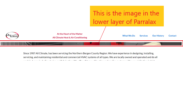
Capture

Hello @mcaravaglia,

To better assist you with your issue, kindly provide us access to your site so that we can check your section’s background settings. Please create a secure note with the following info:
– Link to your site
– WP login URL
– WP username
– WP password
– WP Administrator Role
- Confirmation that we can access and make changes to your site

To know how to create a secure note, please check this out: How The Forum Works

Cheers.

Hey @mcaravaglia,

Thank you for providing the credentials. Your parallax setup was correct however you needed to increase the Lower Layer Size to have a prominent parallax effect.

image

These are the two separate layers added to a section, e.g if you want to display two background images at a time in a same section then this is most useful features where you can display two background images, one image on top of other image.

The image added to upper layer will be displayed on top of the image added to the lower layer. If you enable only one (either lower or upper) then this will behave normally. As an experiment in your setup I have enabled upper layer as well and set the background color, this will give you an idea how a background color overlays the lower background image in your first section.

You can experiment with different options to learn how these layers work. Hope this helps!

Thank you Nabeel. This does indeed work nicely. I do not, however, understand the “Lower Layer Size” of 250%? It is not enlarging the image, so what is this size setting doing and how do I calculate what it should be each time I need to use it?

I also see you changed the “Size and Position” setting for the Background Layer to “Auto”, while the initial direction I received it was set to “Cover”. It also appears you added a Gap Element to the section? This seems to have made a significant difference.

Is there any documentation that goes into detail on these Parallax settings and how to best use this feature?

Hello @mcaravaglia,

You need to set at least a minimum height of the column because the height of the section background image depends on the height of the column height.

You have to set the size and the position of the background image. To get familiar with the background option, please do check out the video series instead:
https://www.youtube.com/playlist?list=PLWPh_GoP7hYU_bsFHaG4CvIhWiafNS1f5

Best Regards.

Thank you Ruenel. I will view the video. Meanwhile, I chose to create the Parallax effect with CSS as it yields better results than I have been able to get with any of these settings.

Hi @mcaravaglia,

Although we suggest using the Theme default options, still if the custom CSS helps, you can go with it.

Thanks

Just out of curiosity, what does your code look like for the background lock effect?

Hey Marc,

Thanks for updating in! You may need to check out these old threads:

Best Regards.

This topic was automatically closed 10 days after the last reply. New replies are no longer allowed.