Hi @l_eckardt,
I guess we have different resolutions that’s why we are seeing different layouts. Upon further investigation, I found out that it has something to do with the layout screen sizes.
First, let talk about your “Follow the story of Comfort” Headline.
This is what you see on the back-end:
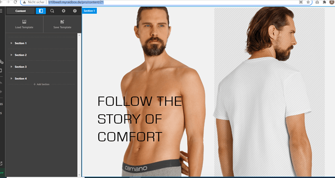
But what I see on my end:
With the comparison above, I believe that your browser resolution in the back-end falls under LG and in the front-end, the resolution is XL.
Layout Screens:
S > 320px to 480px
SM > 480px to 767px
MD > 767px to 979px
LG > 979px to 1200px
XL > 1200 and up
To fix your issue and follow your back-end layout, you need to change the layout screen of your XL to 2 columns because currently it is set to 1 column.
Same scenario on the Section 3 row, just also change the XL to 1 because currently it is set to 4 columns.
Hope that helps.
Thank you.


